
Mojaka Studio — selected work

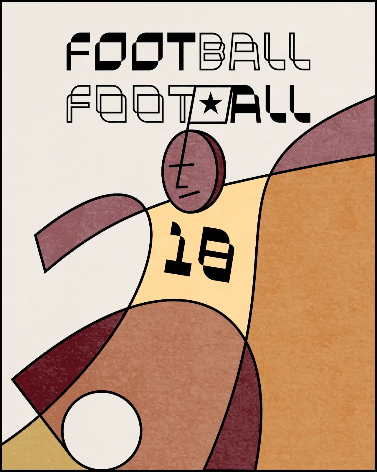
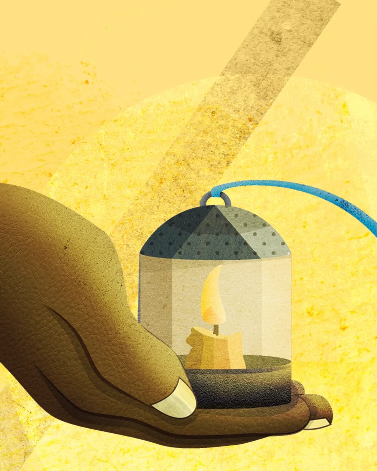
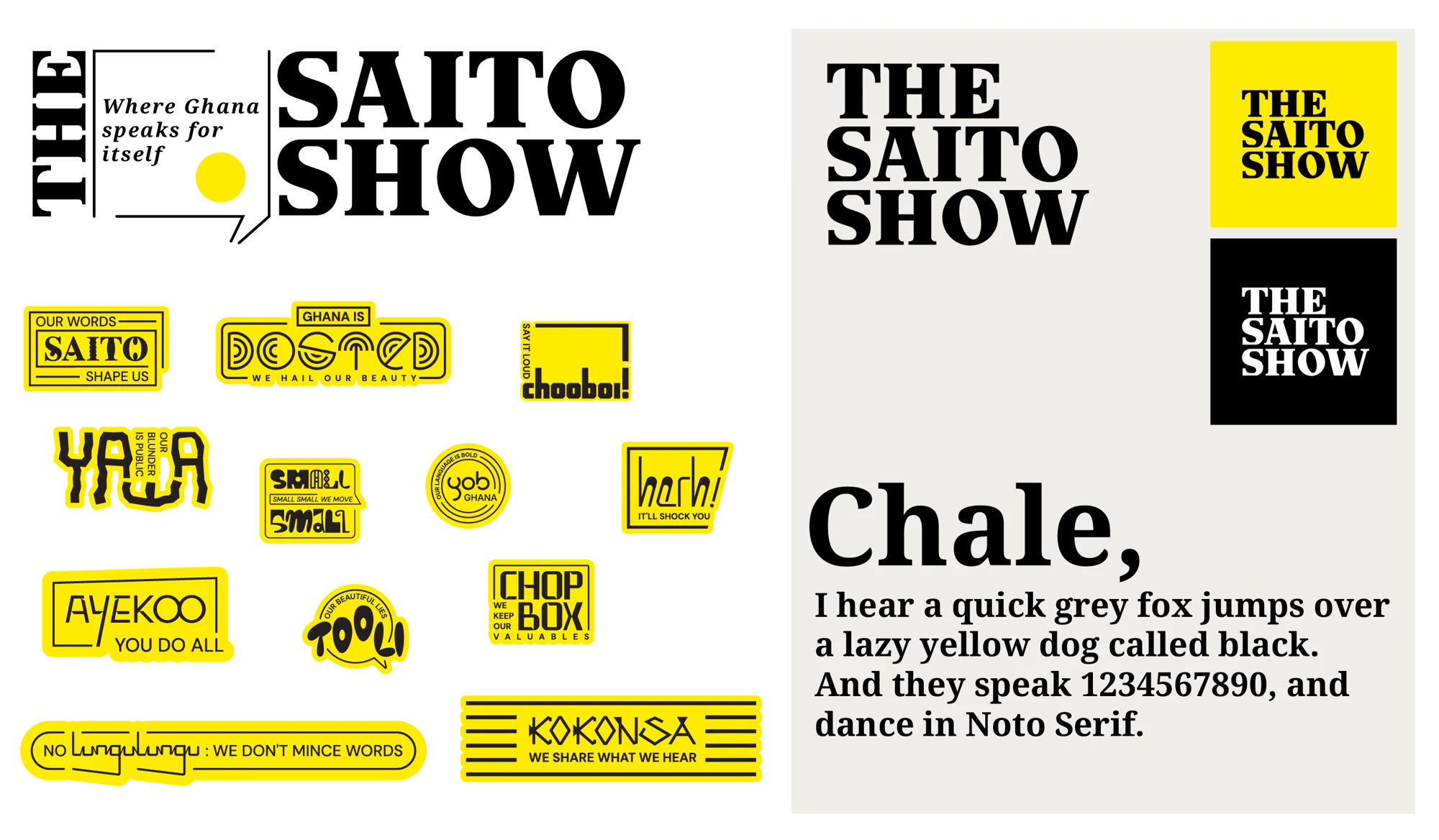
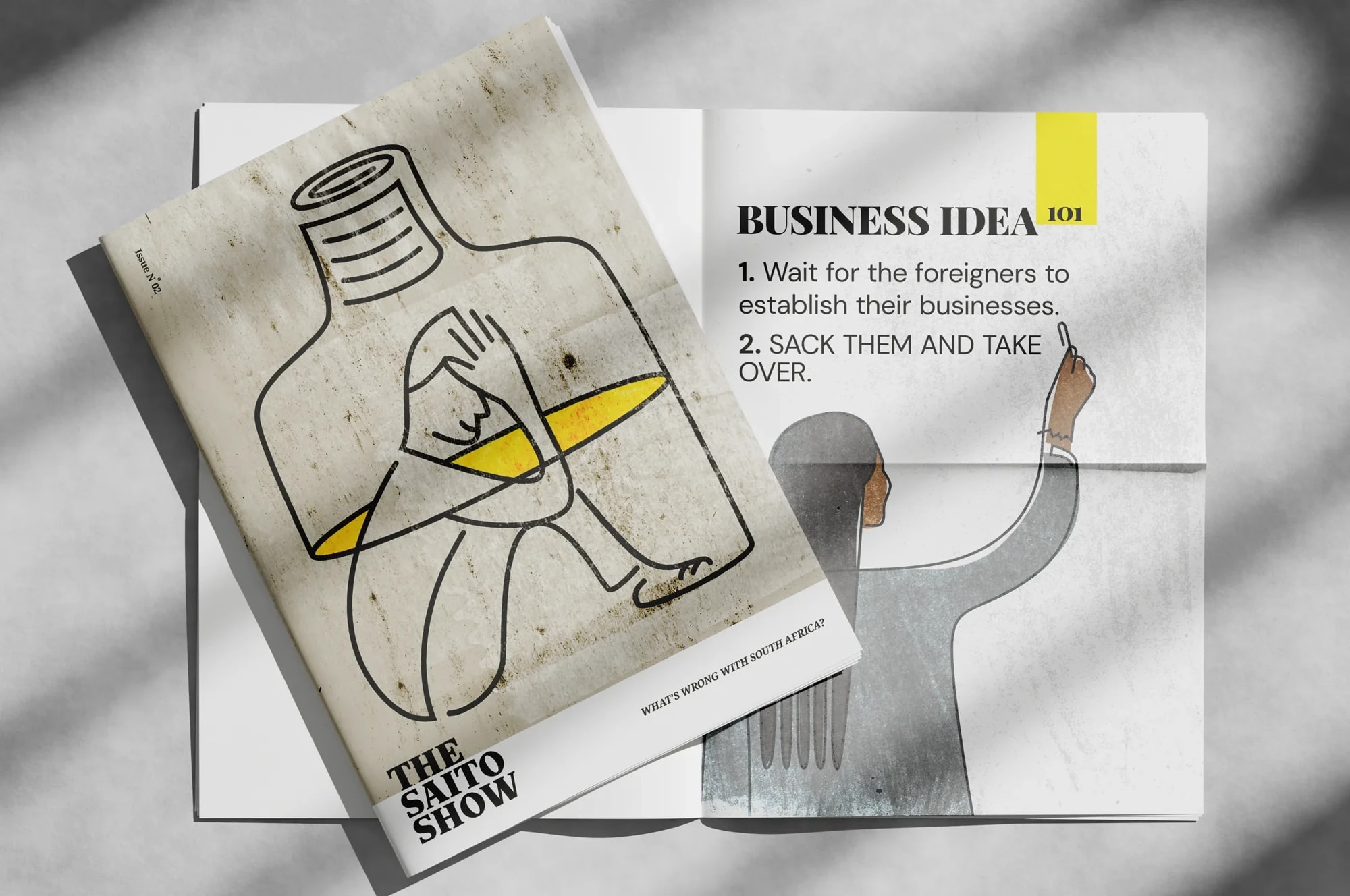
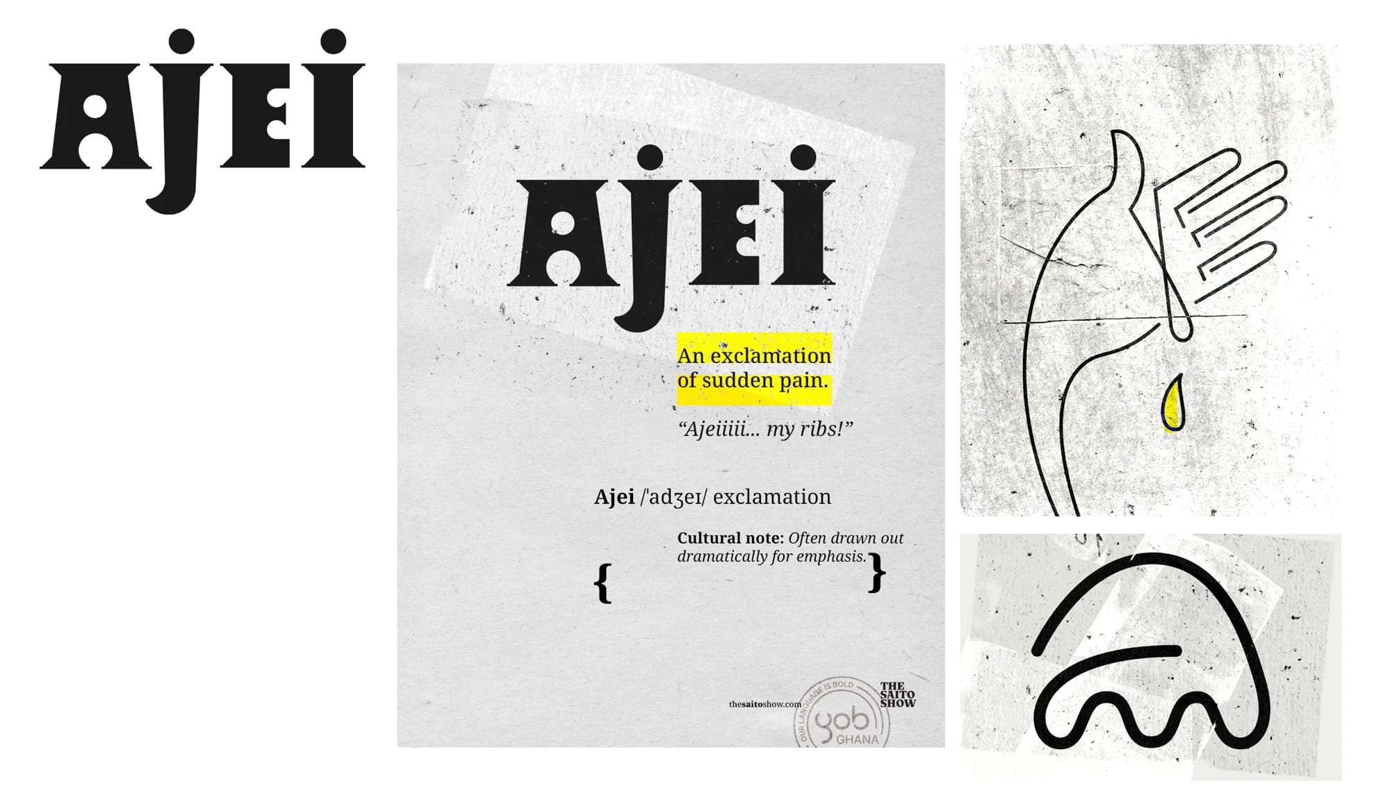
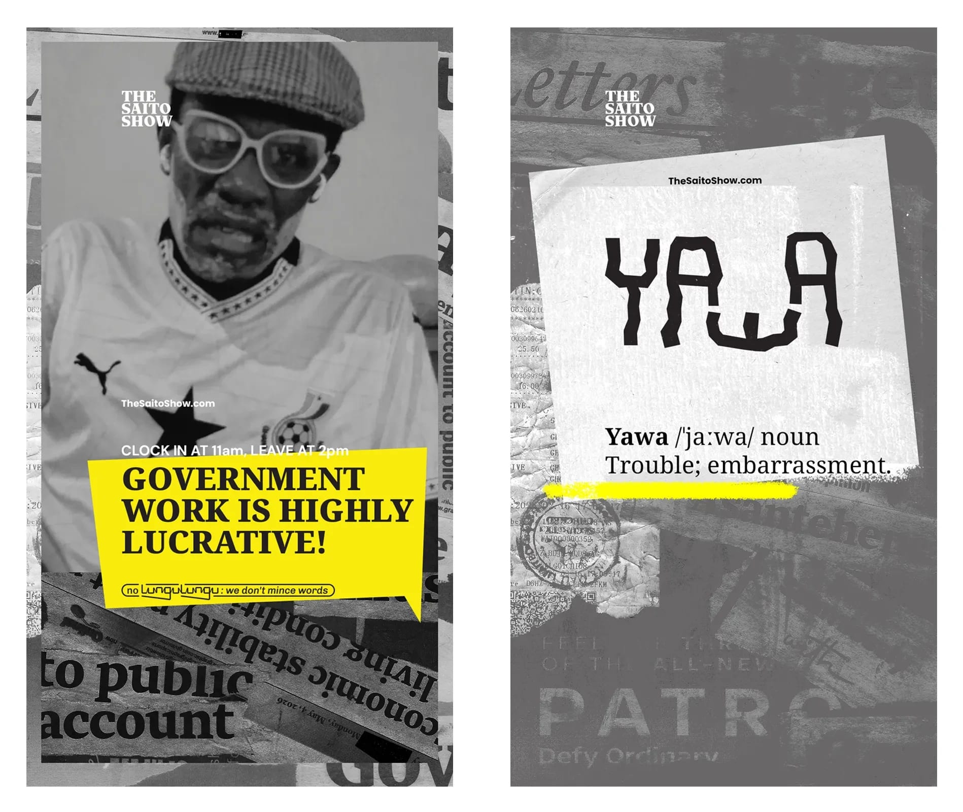
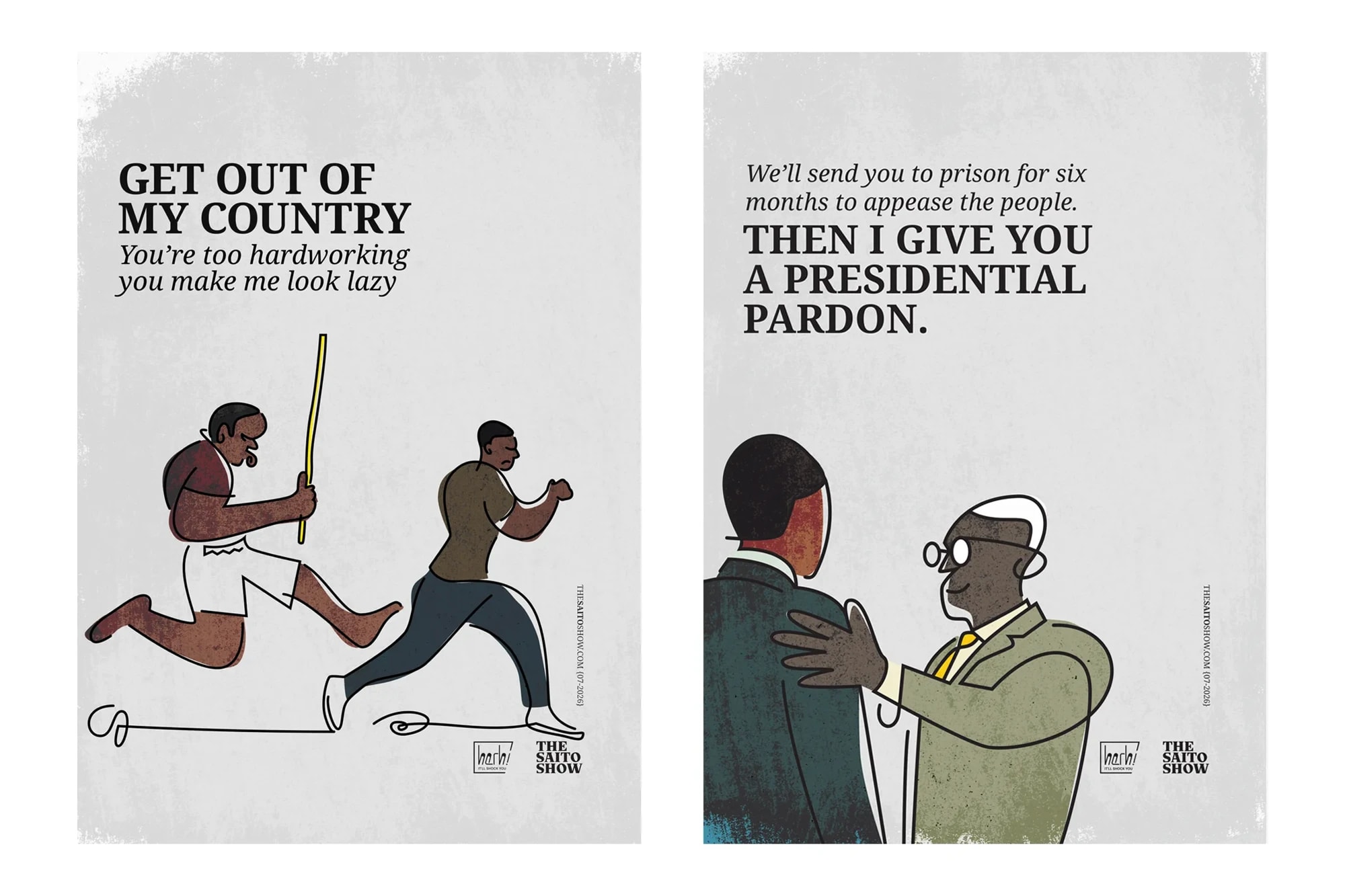
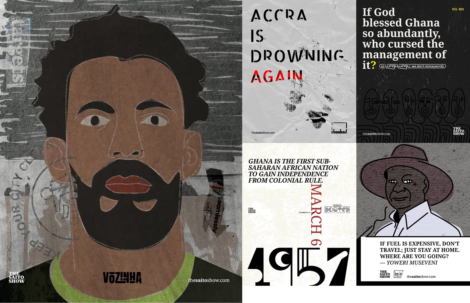
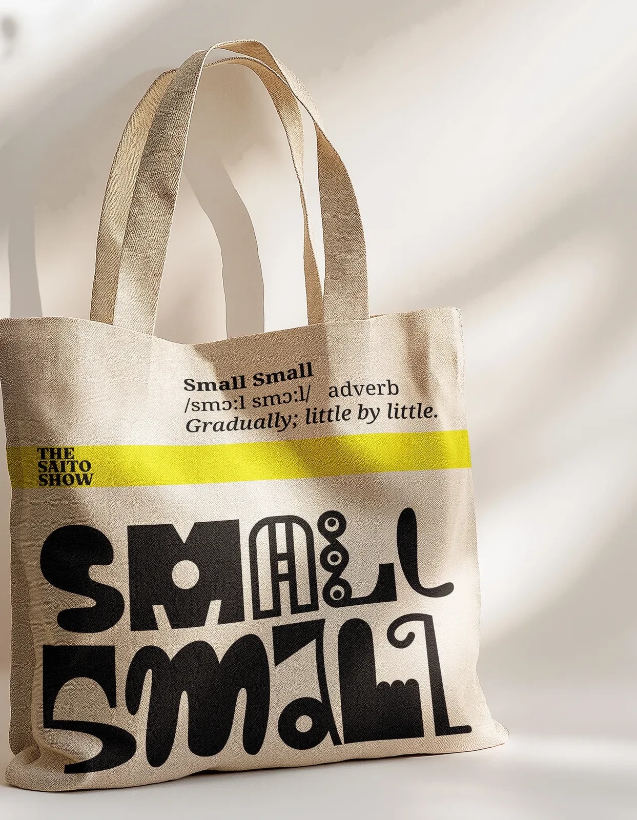
The Saito Show is an ongoing visual commentary on contemporary Ghanaian life. Through satire, illustration, typography and writing, it observes the language, humour, contradictions and everyday experiences that shape the culture. Moving between digital media, editorial design, cultural archiving and print, the project uses humour as both an invitation and a provocation—celebrating what deserves to be preserved while questioning what needs to change.
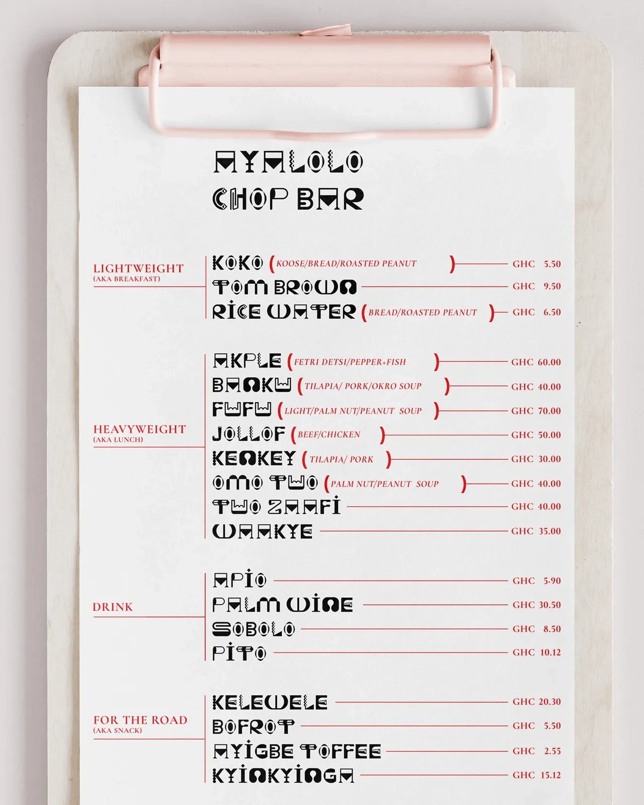
Ayalolo thrives on contrast and structural tension. Its glyphs span a spectrum of weights and personalities—from fragile hairlines to dense, sculptural black forms. Some characters are quiet and reserved; others are unapologetically audacious. Certain letters command space with the extravagance of a booming empire, while their compact, frugal counterparts whisper in the margins. Yet across these contrasting rhythms and visual behaviours, every character converges into a striking, unified whole.
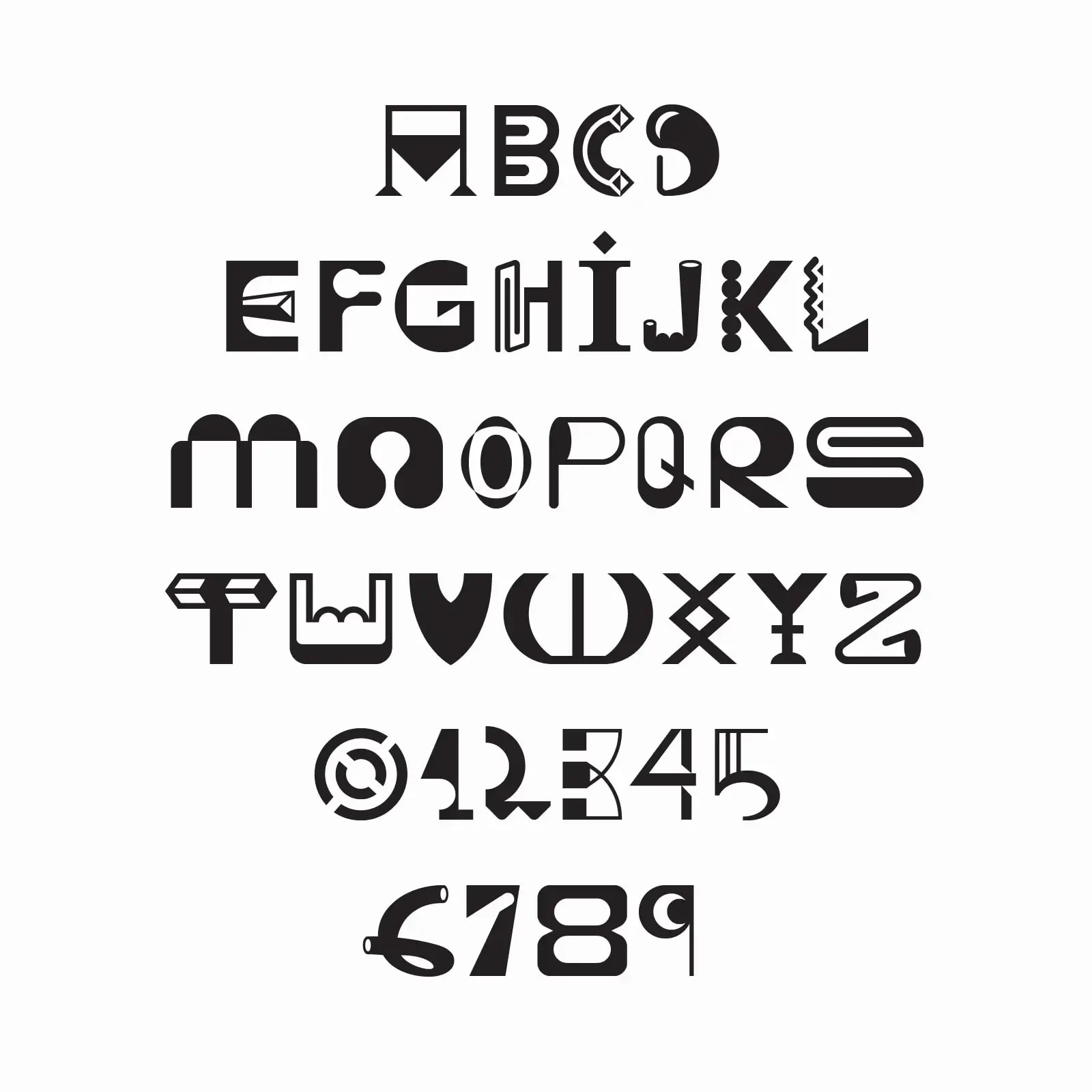
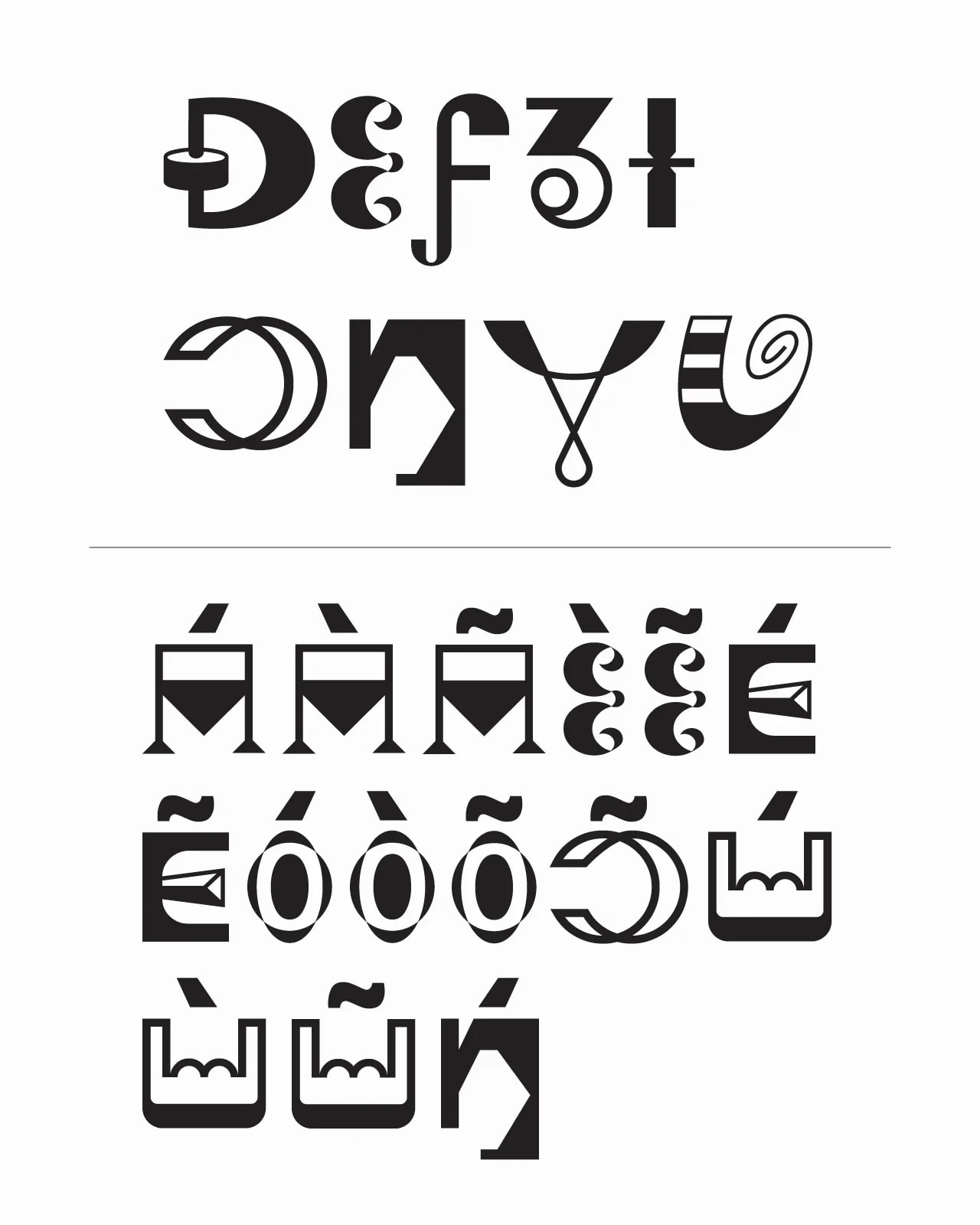
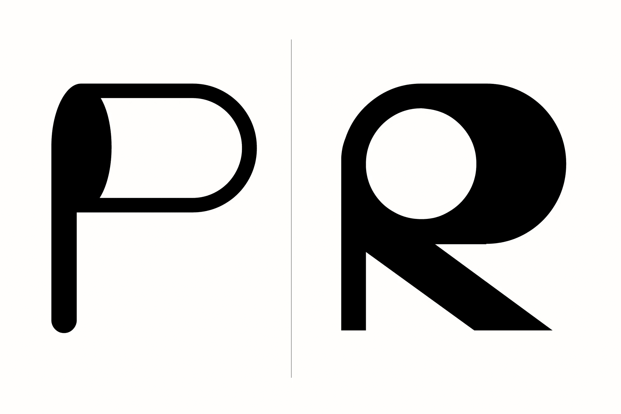
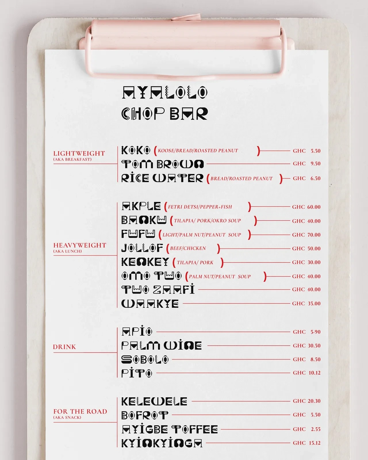
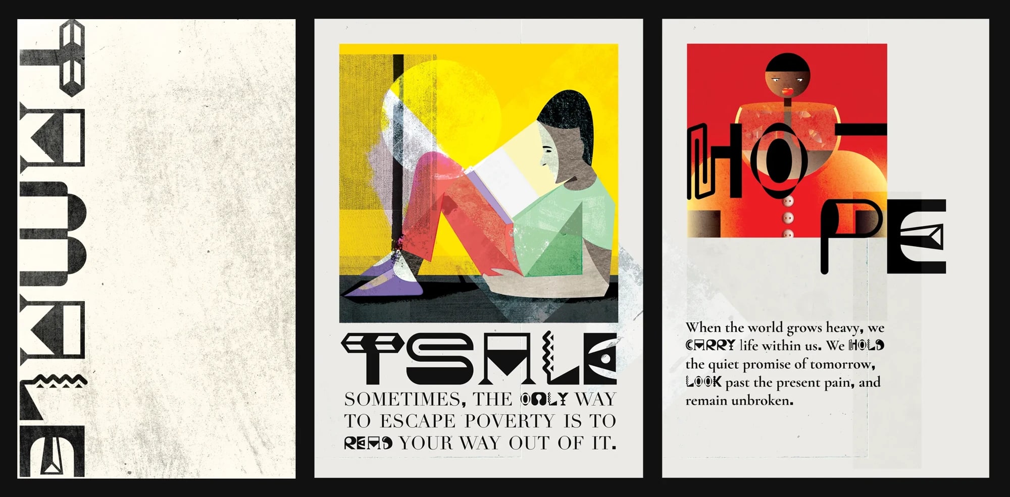
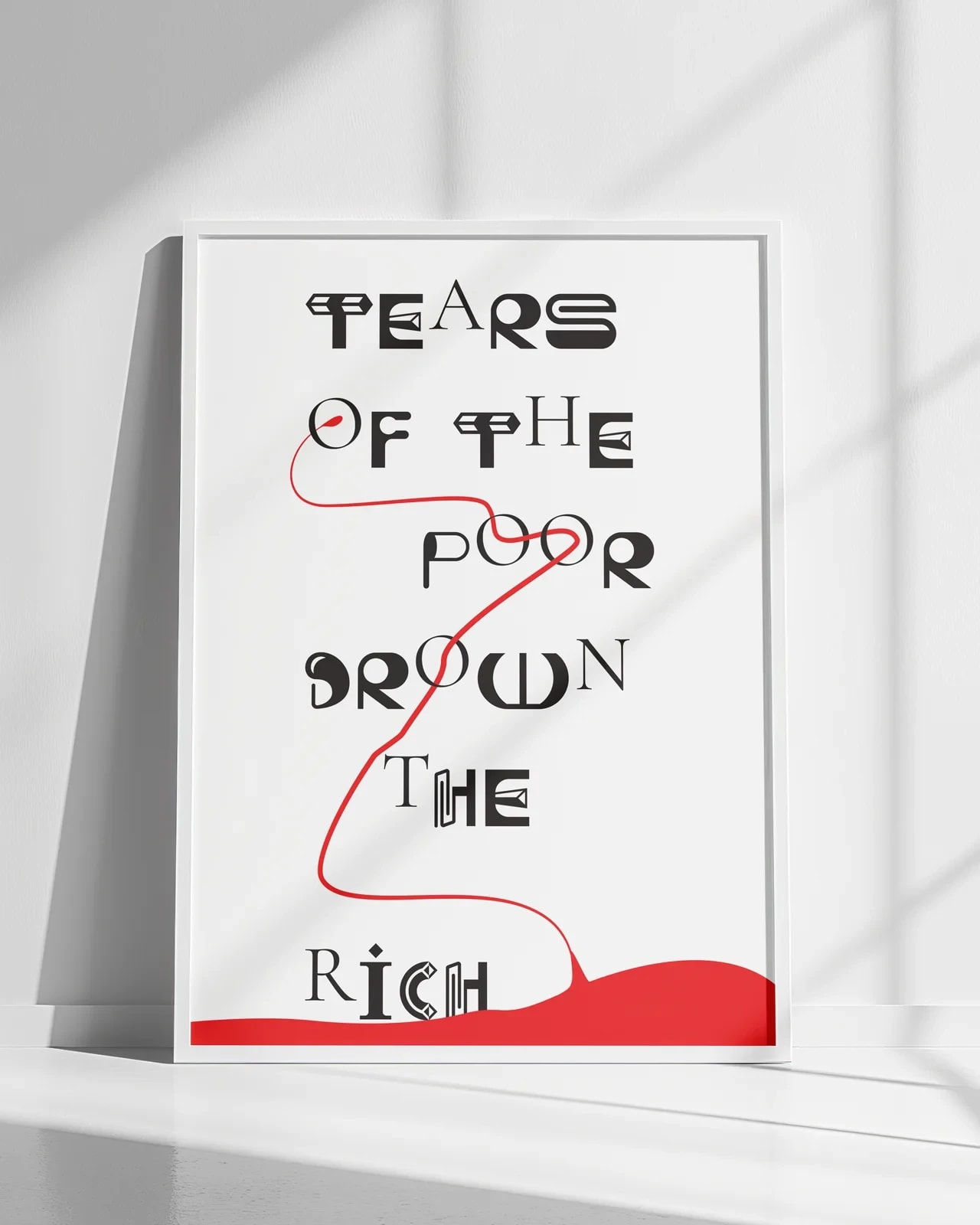
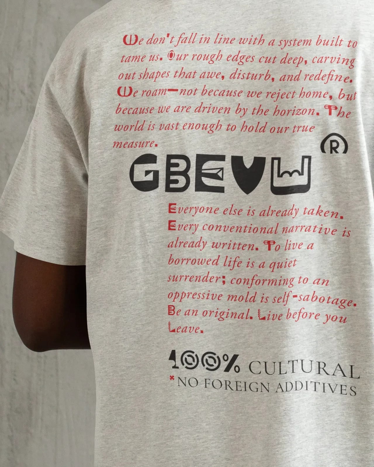
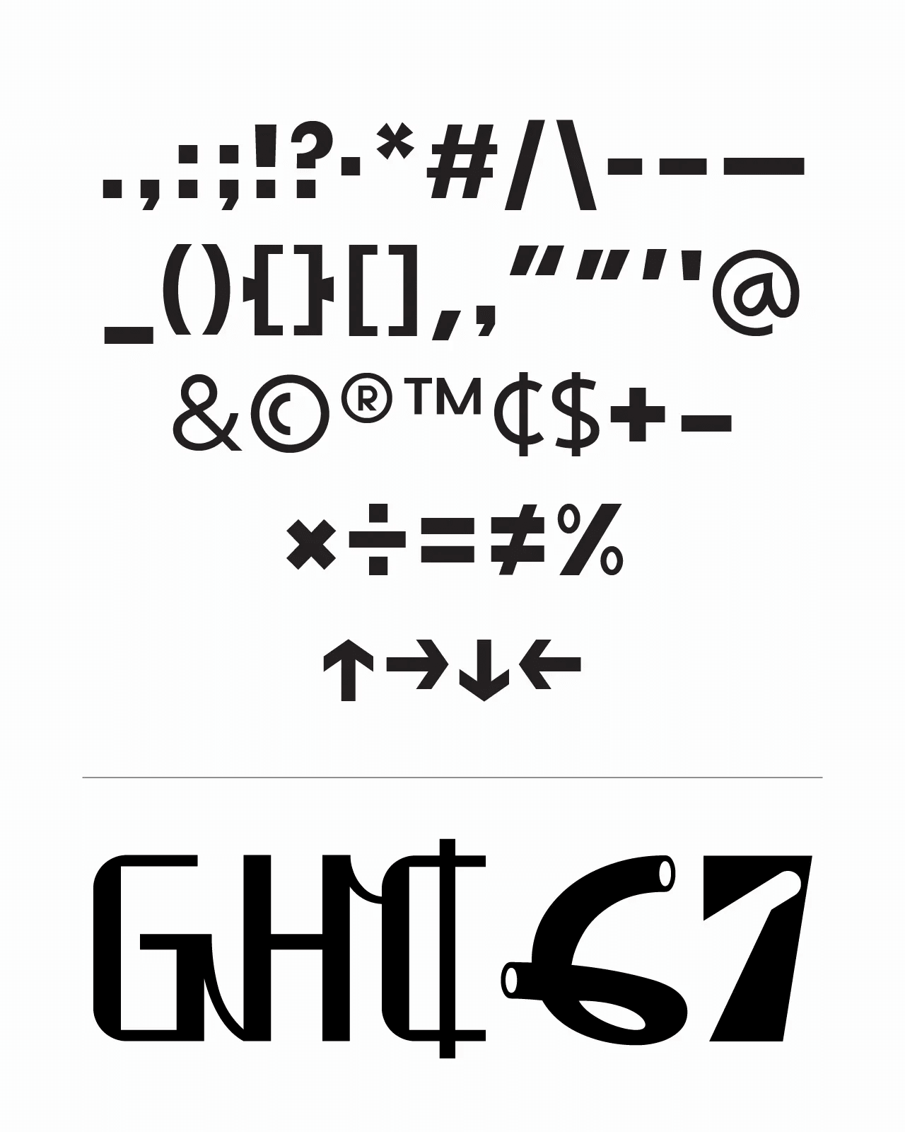
A typographic study of abundance and possibility, moving between lettering, pattern, image and object.
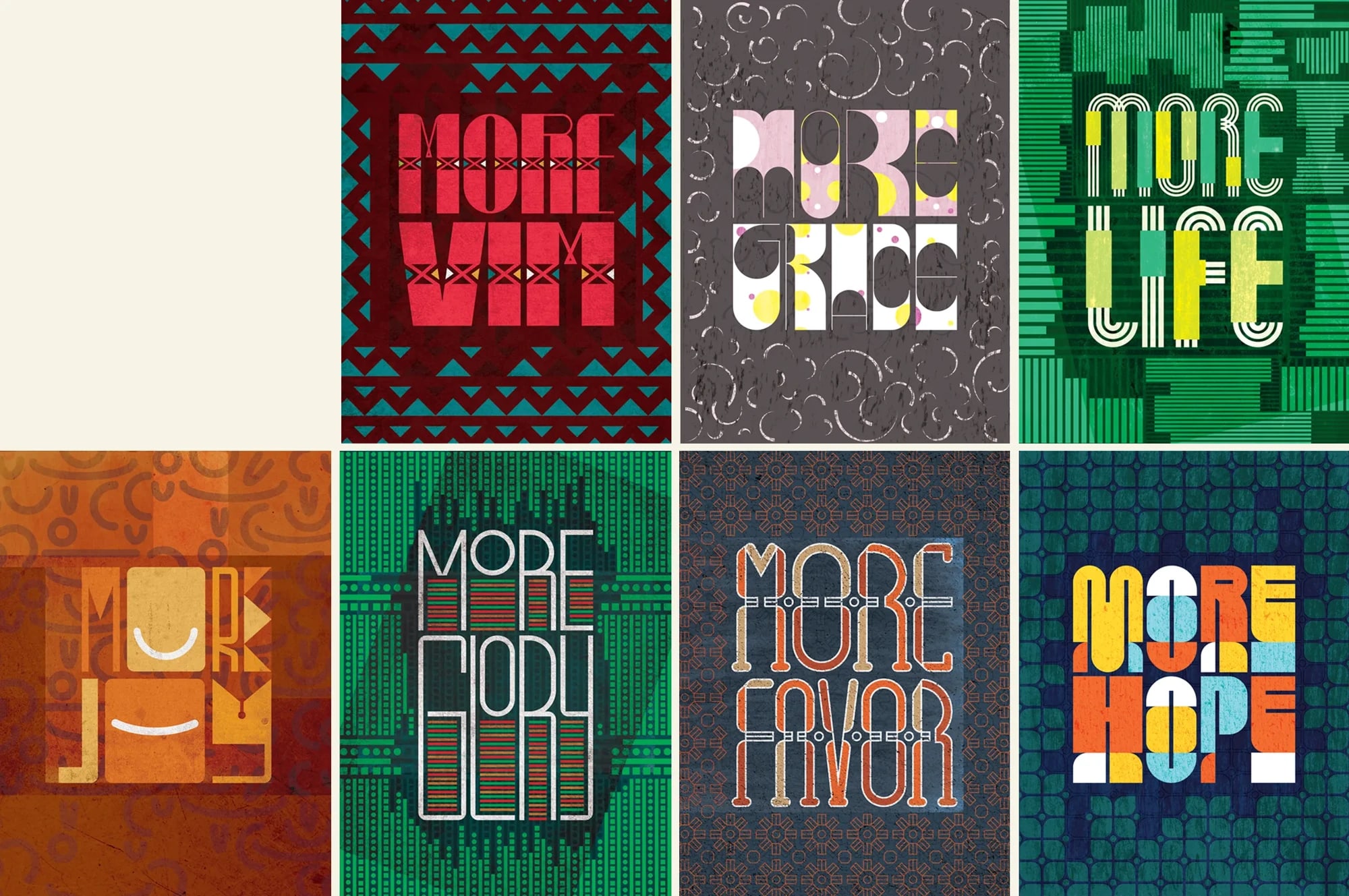
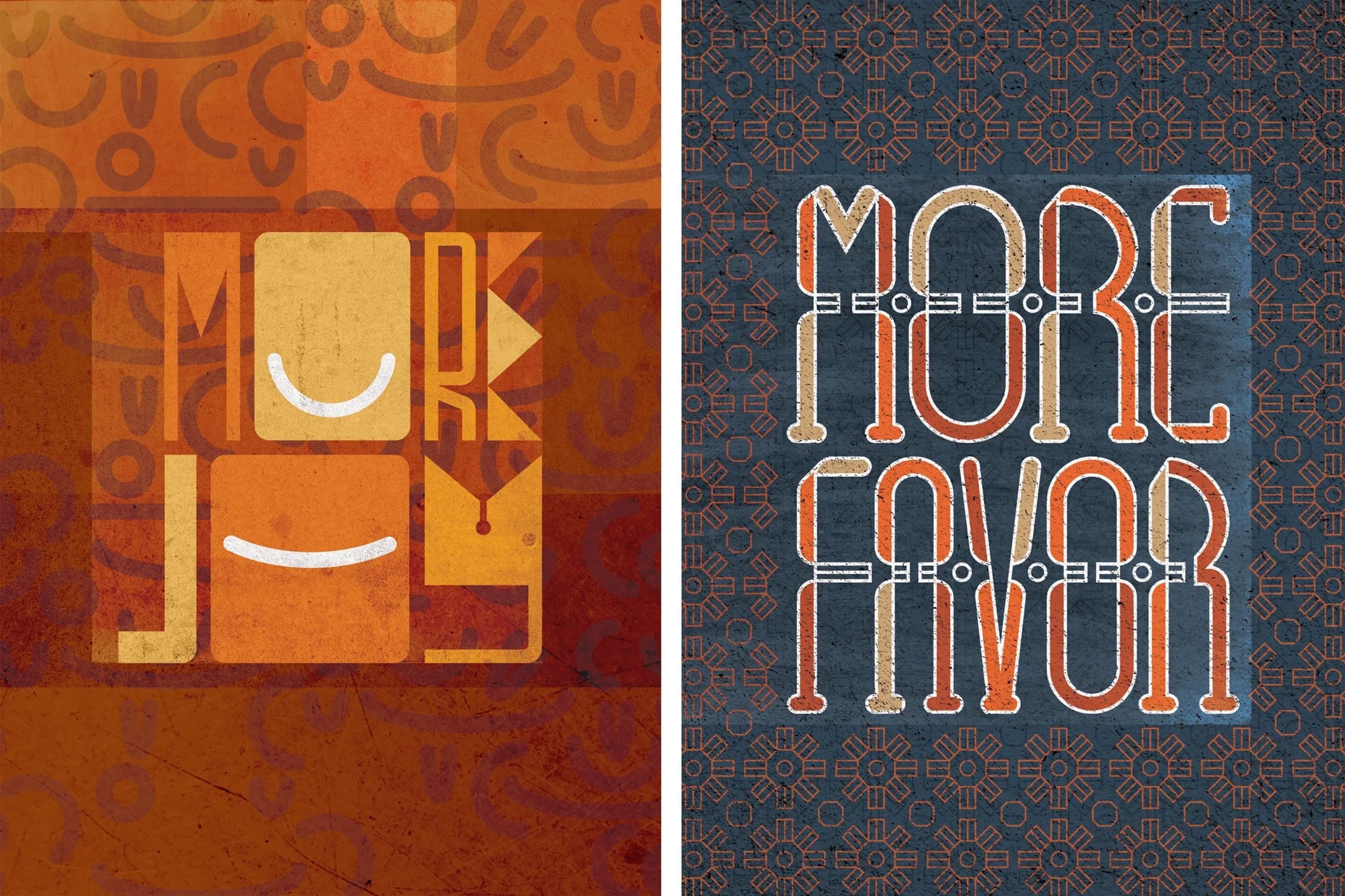
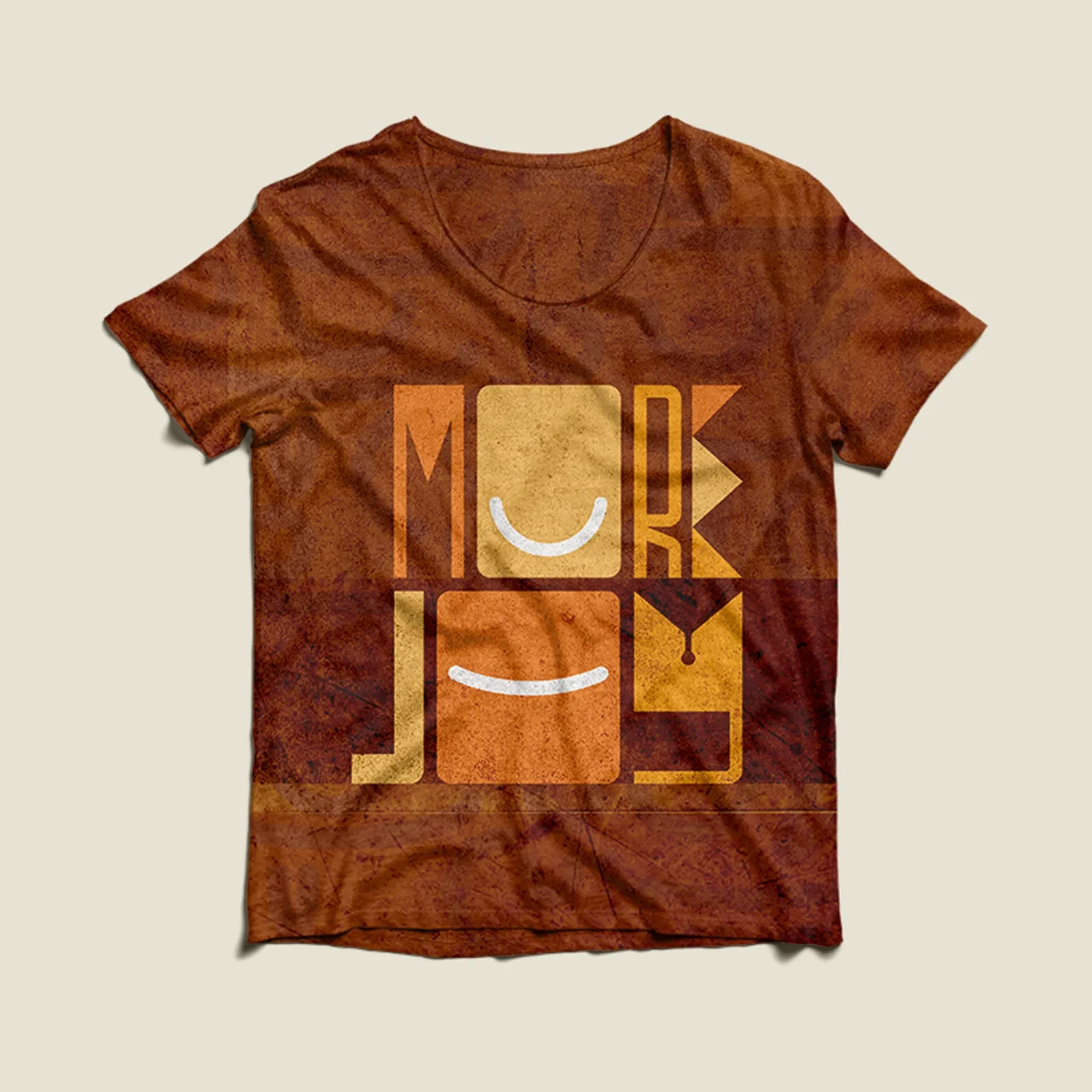
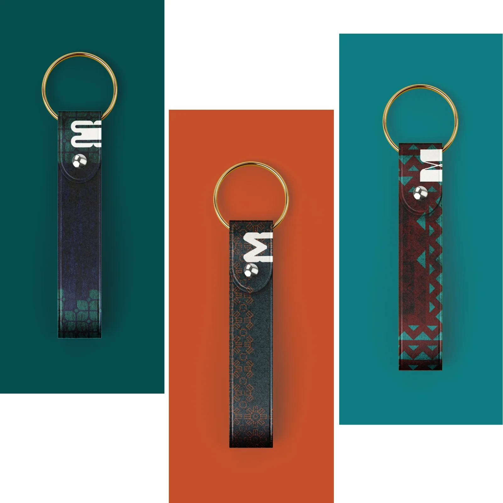
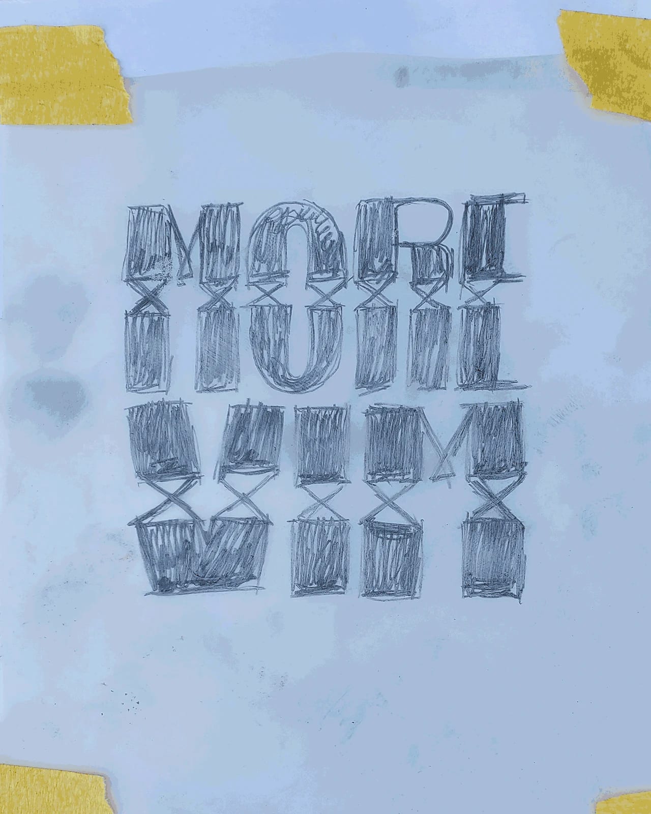
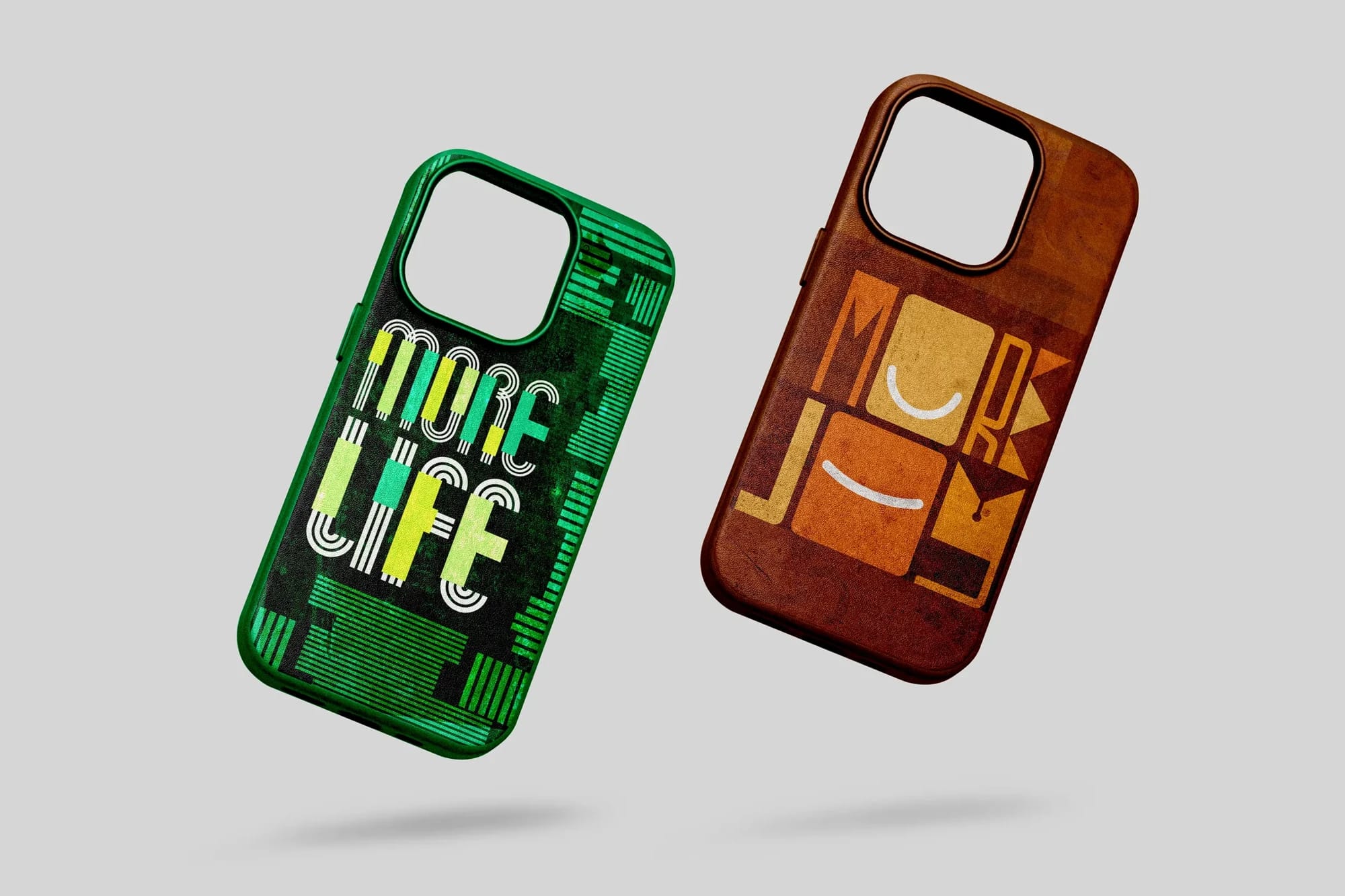
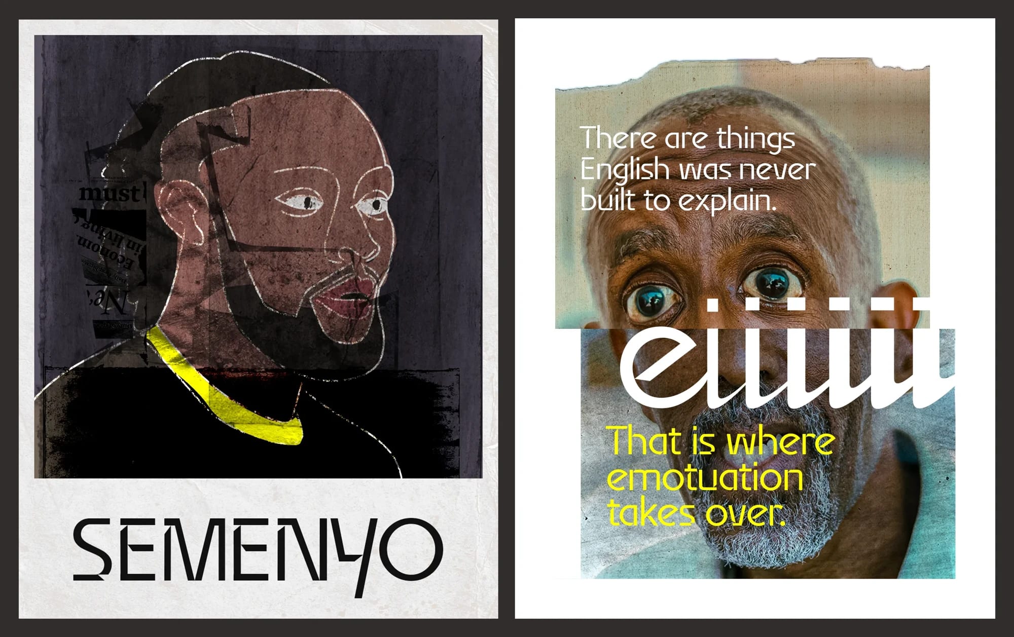
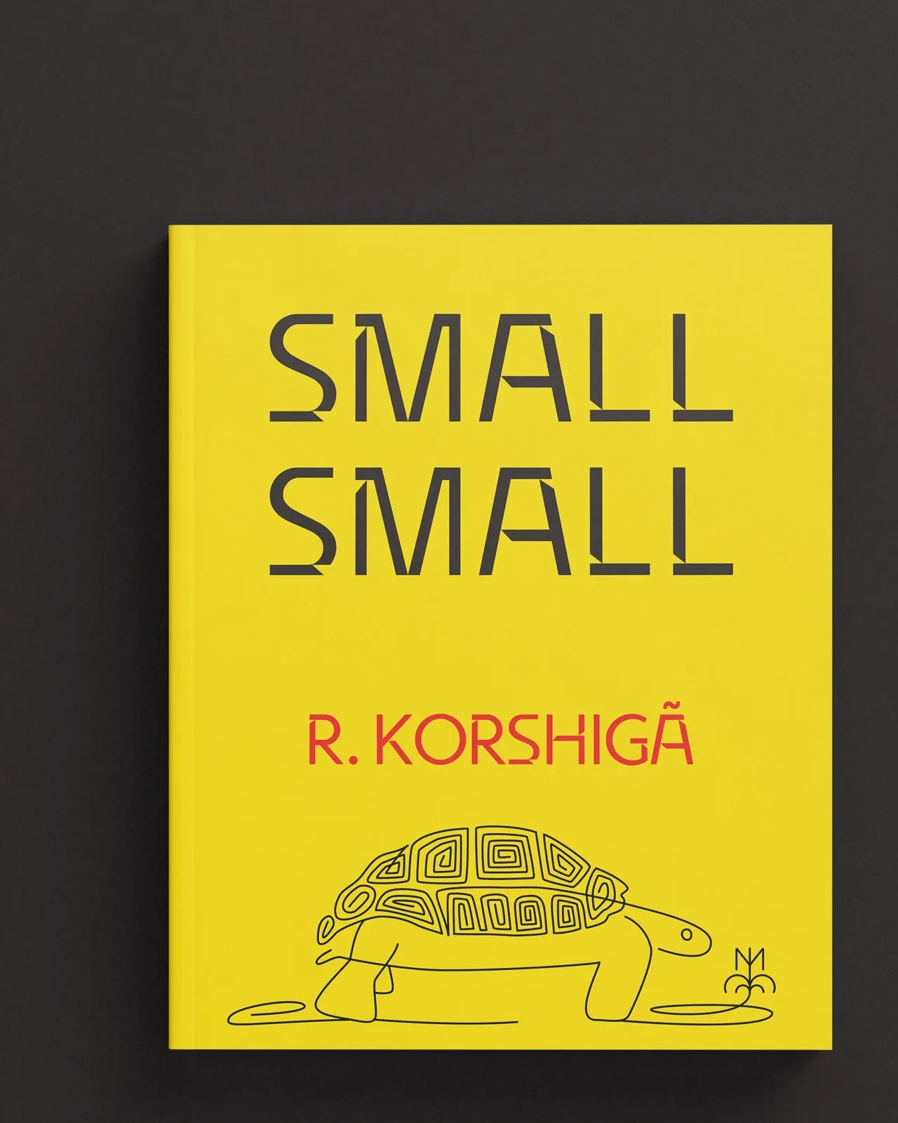
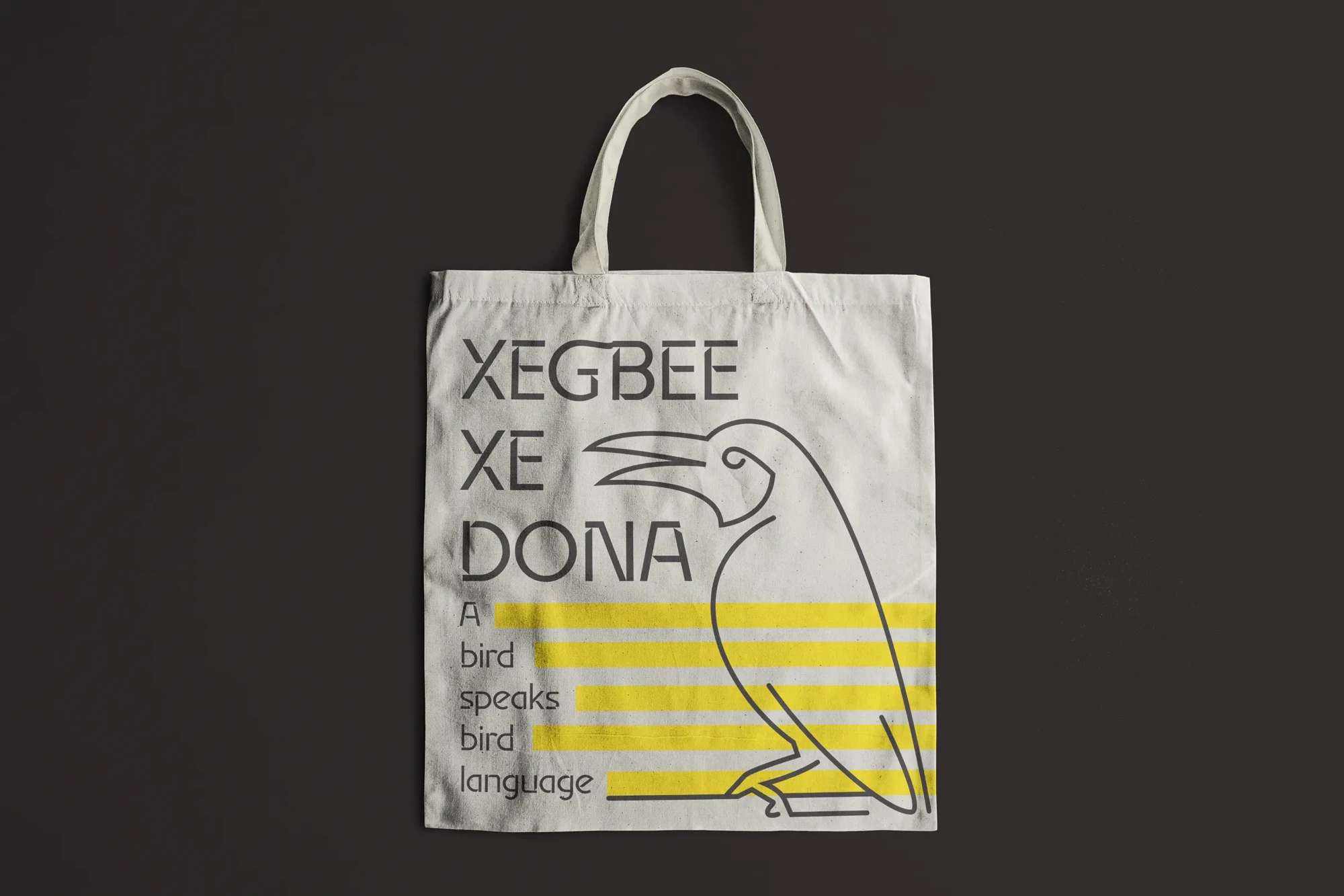
Kete is an experimental typeface exploring the relationship between language, emotion and cultural expression. Developed from within Eʋe visual and linguistic culture, it extends into Emotuation: an investigation into how typography can carry expressive utterances through duration, emphasis and repetition. Specimens, posters, a publication and everyday objects put this language into use.
Developed during the KBI Decolonizing Latin Typography Incubator.
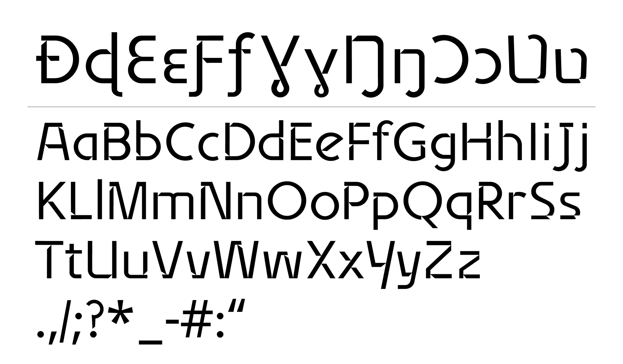
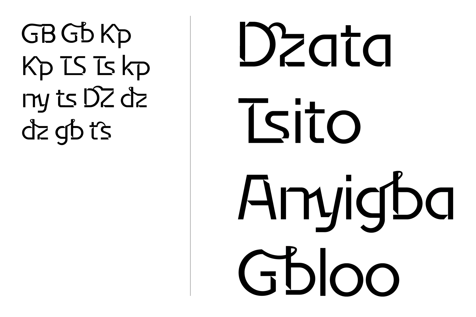
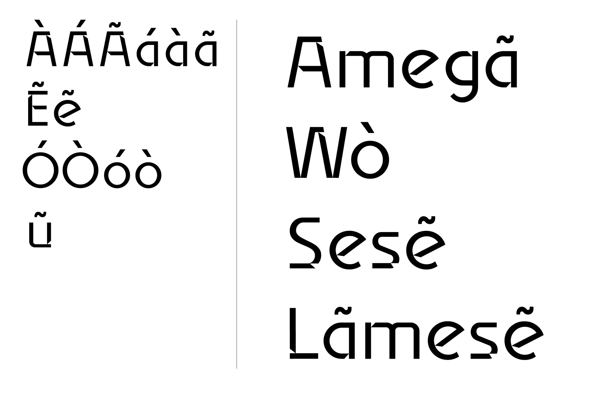
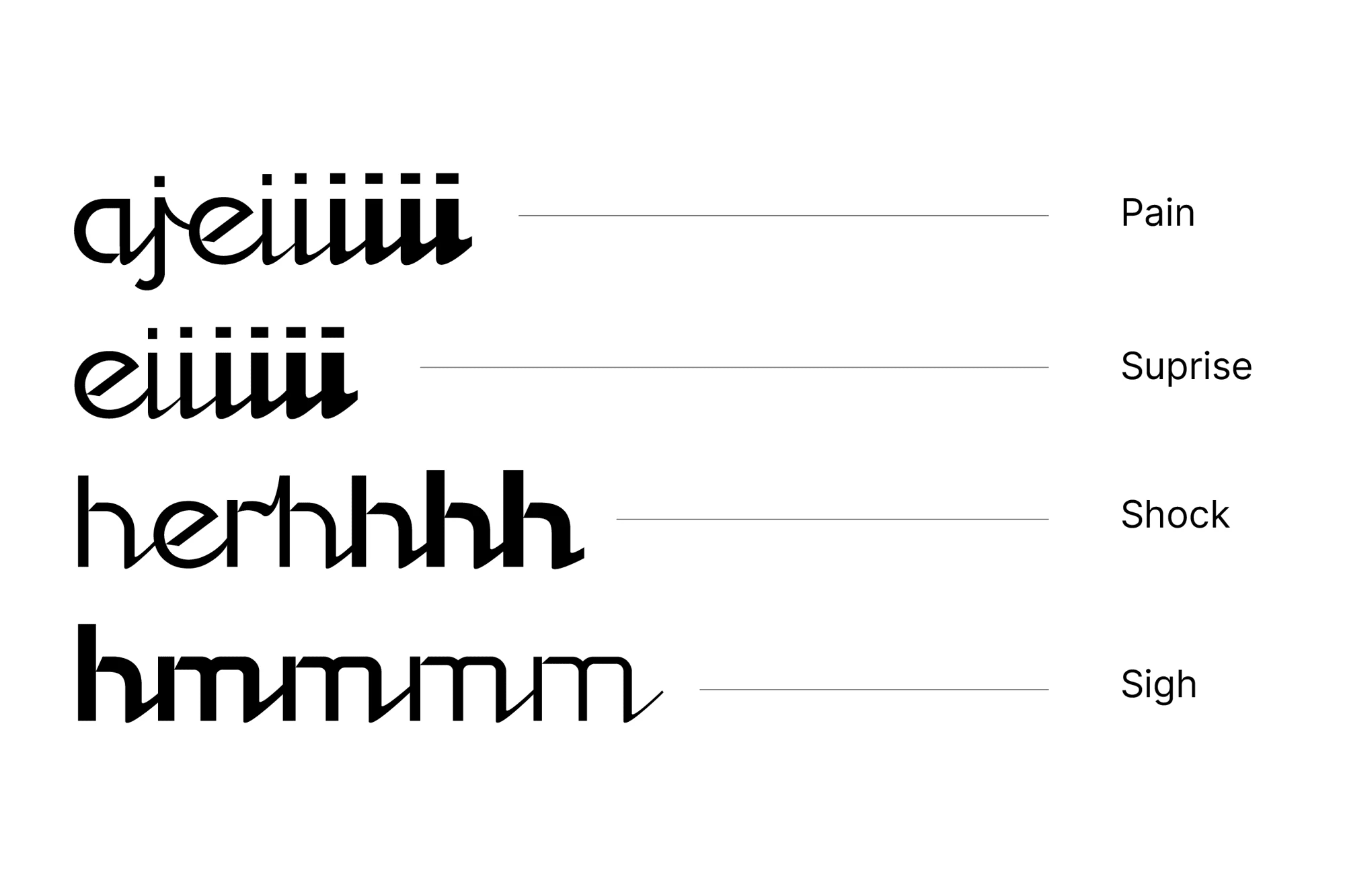
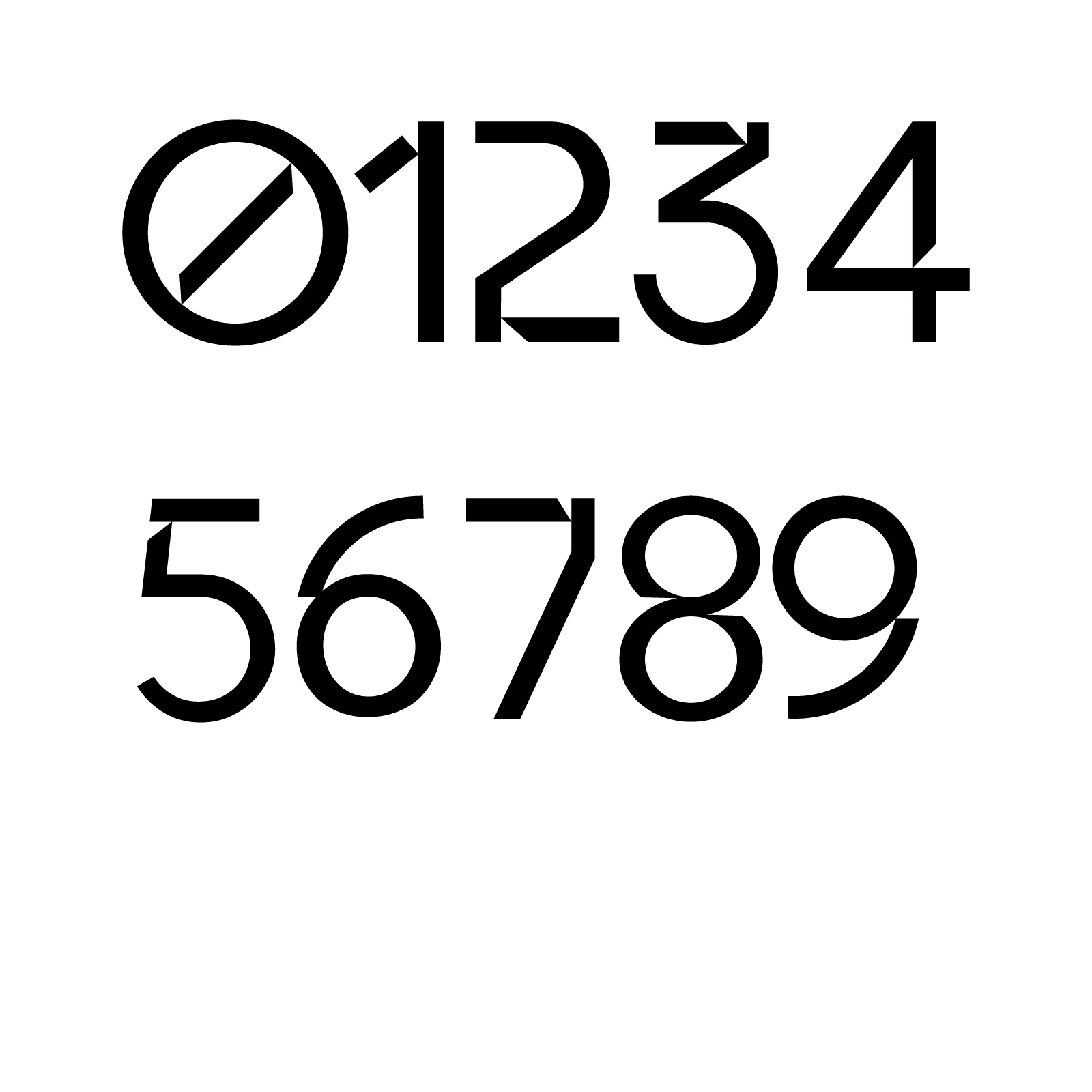
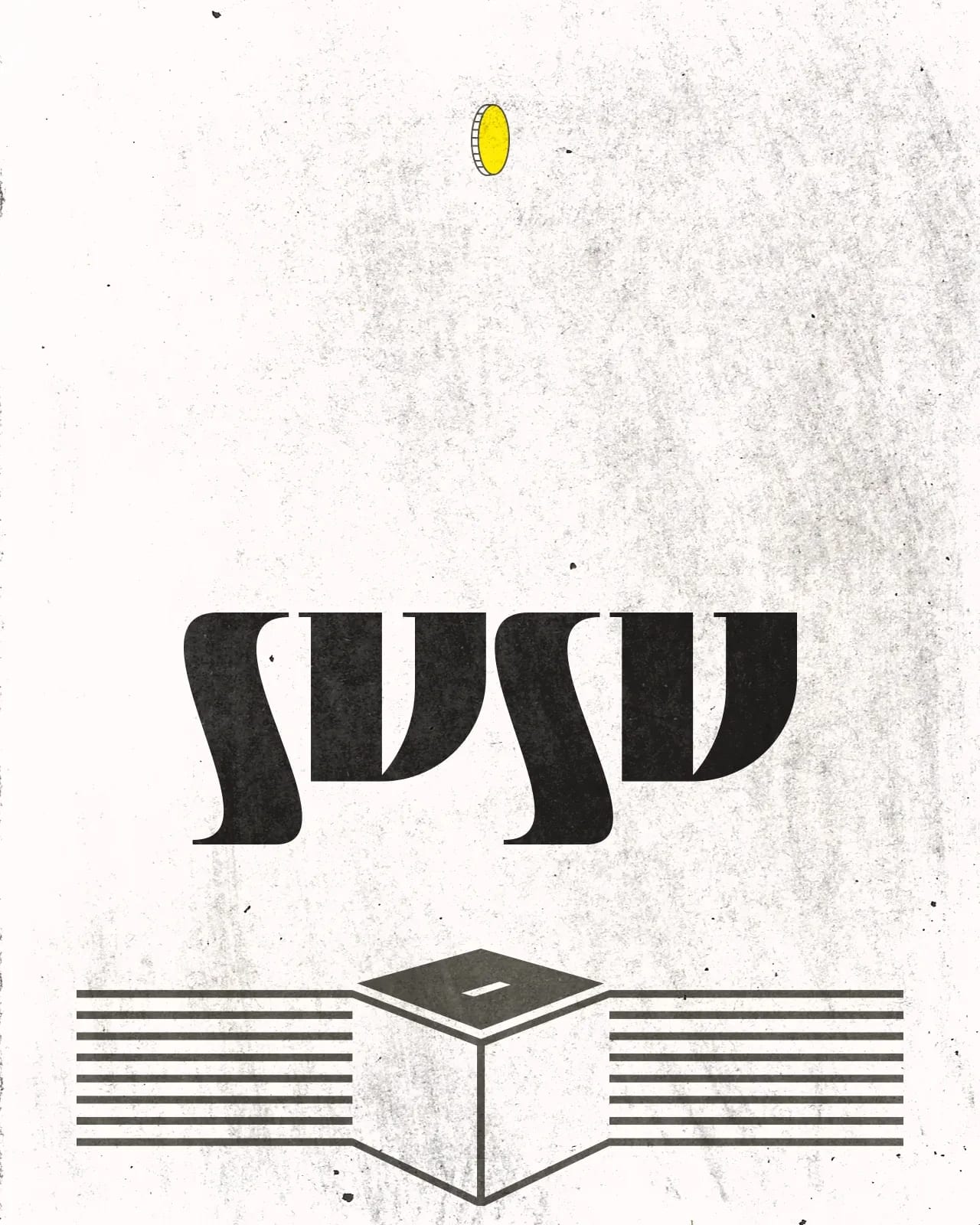
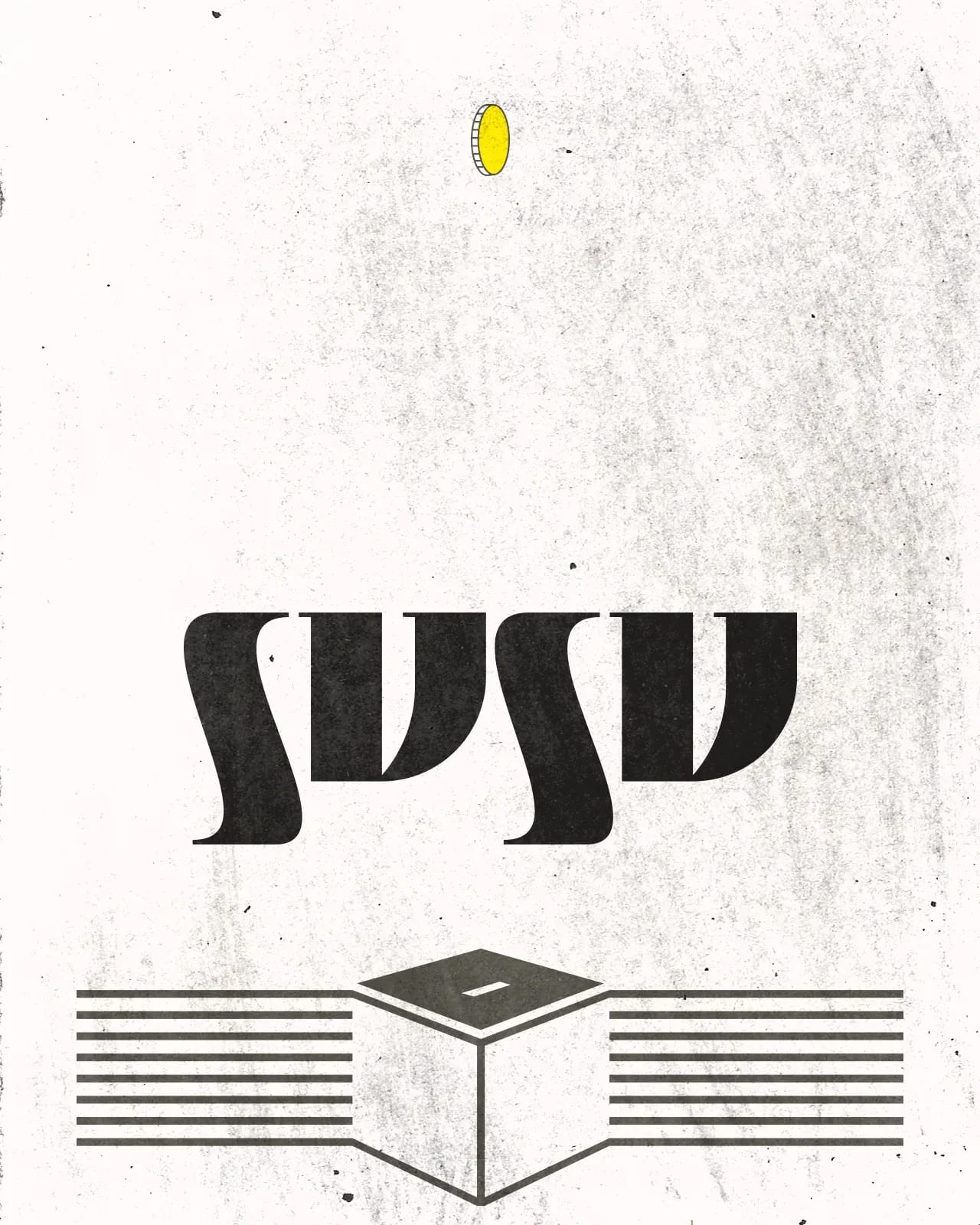
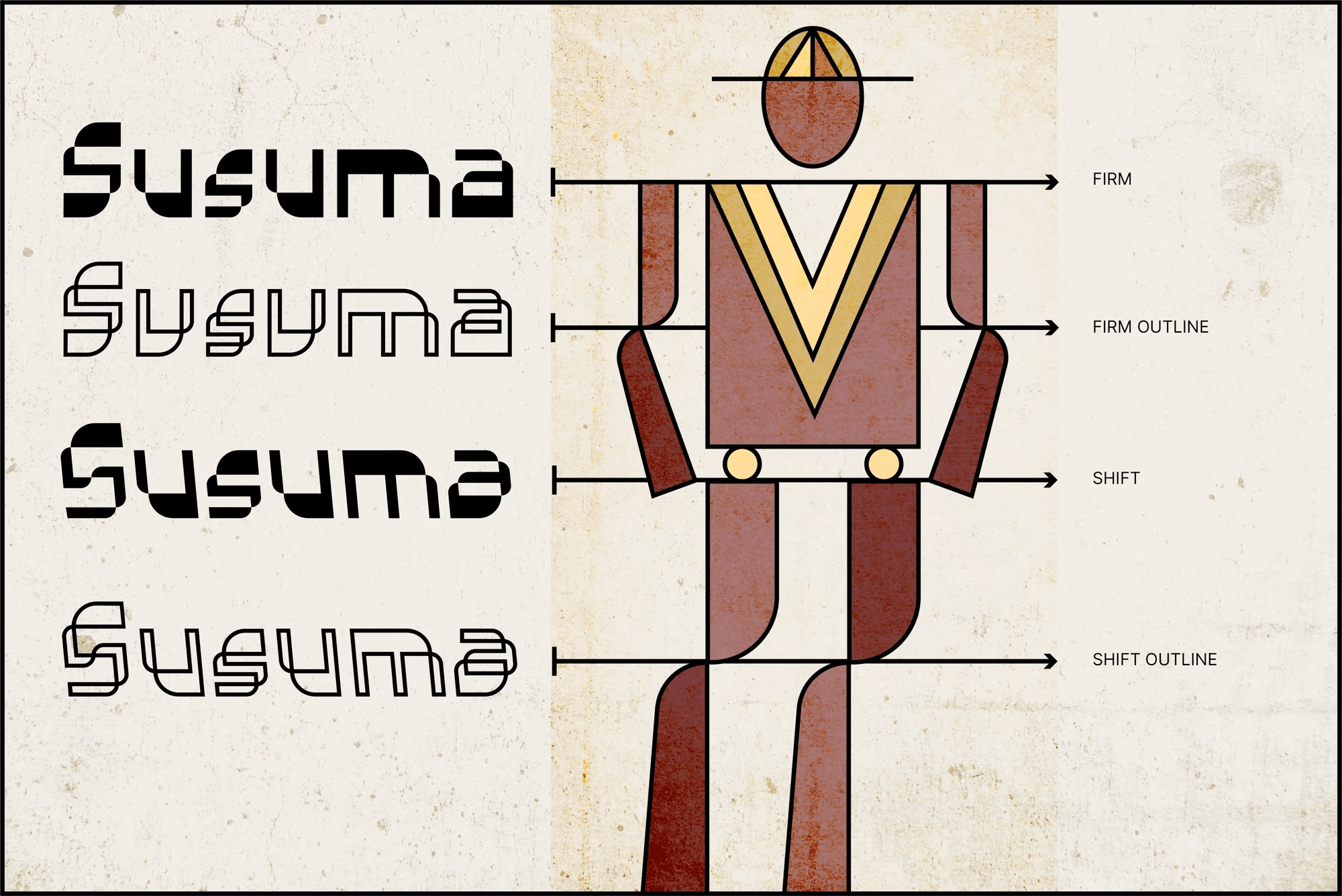
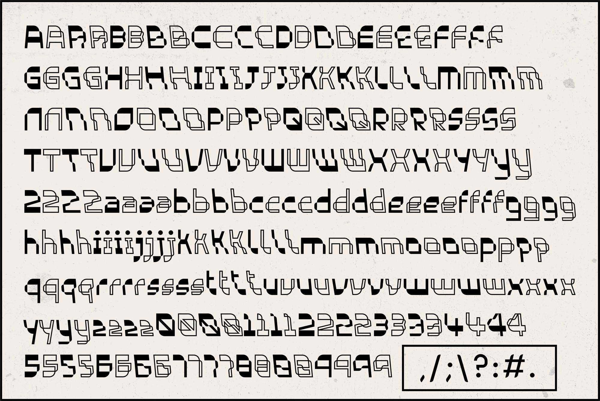
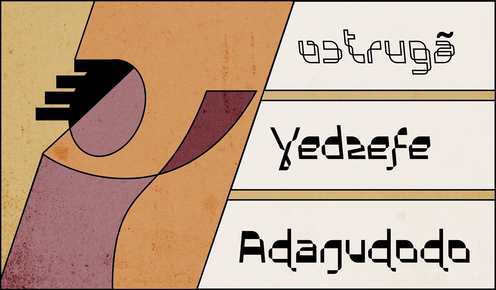
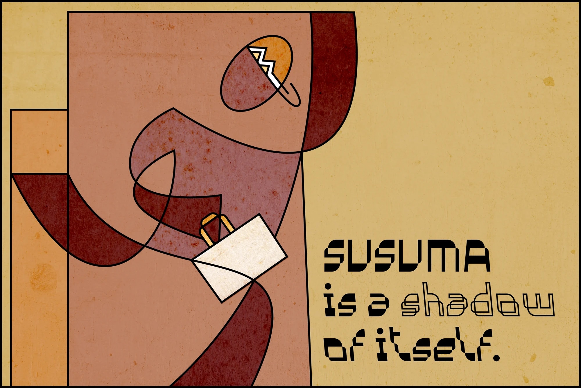
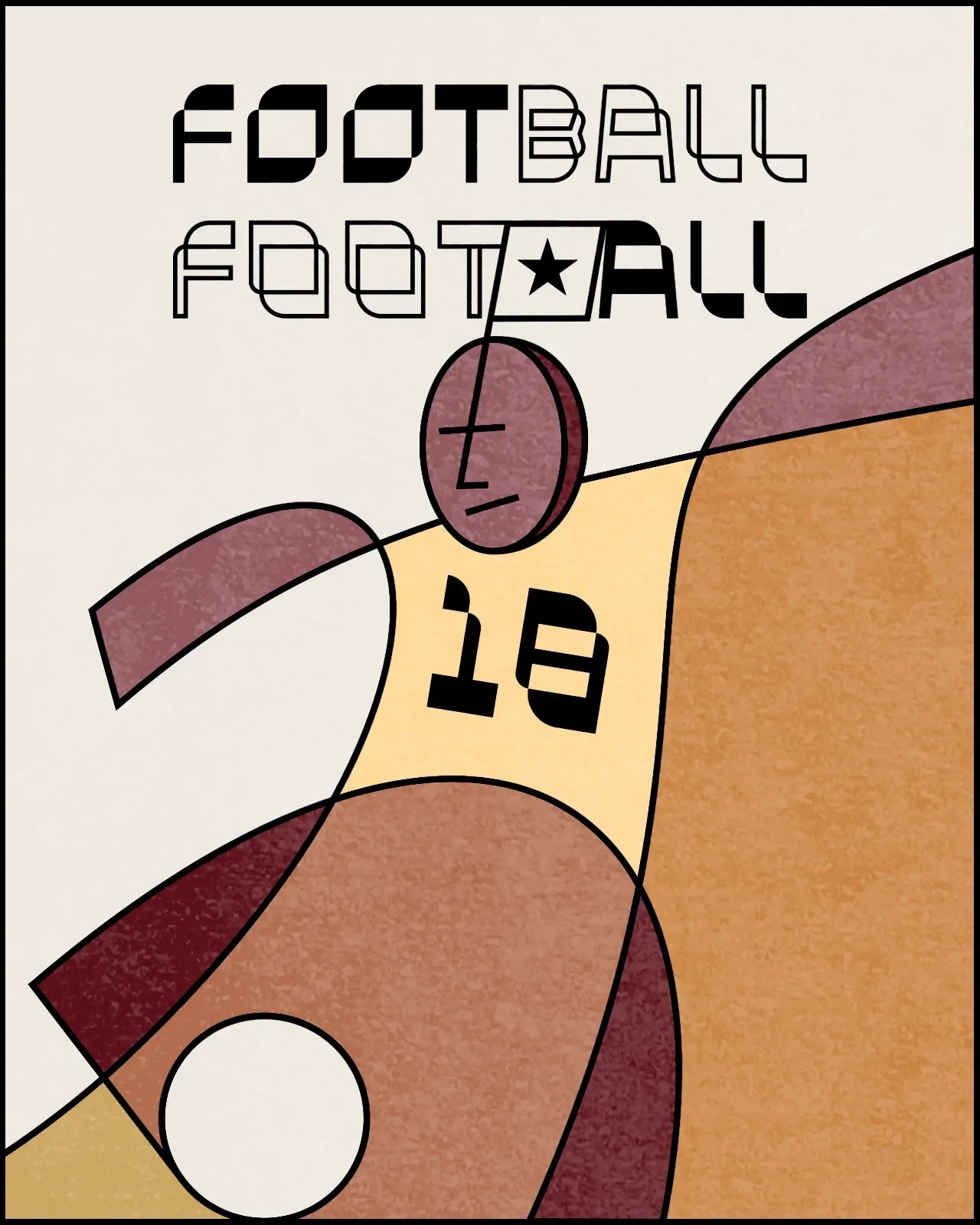
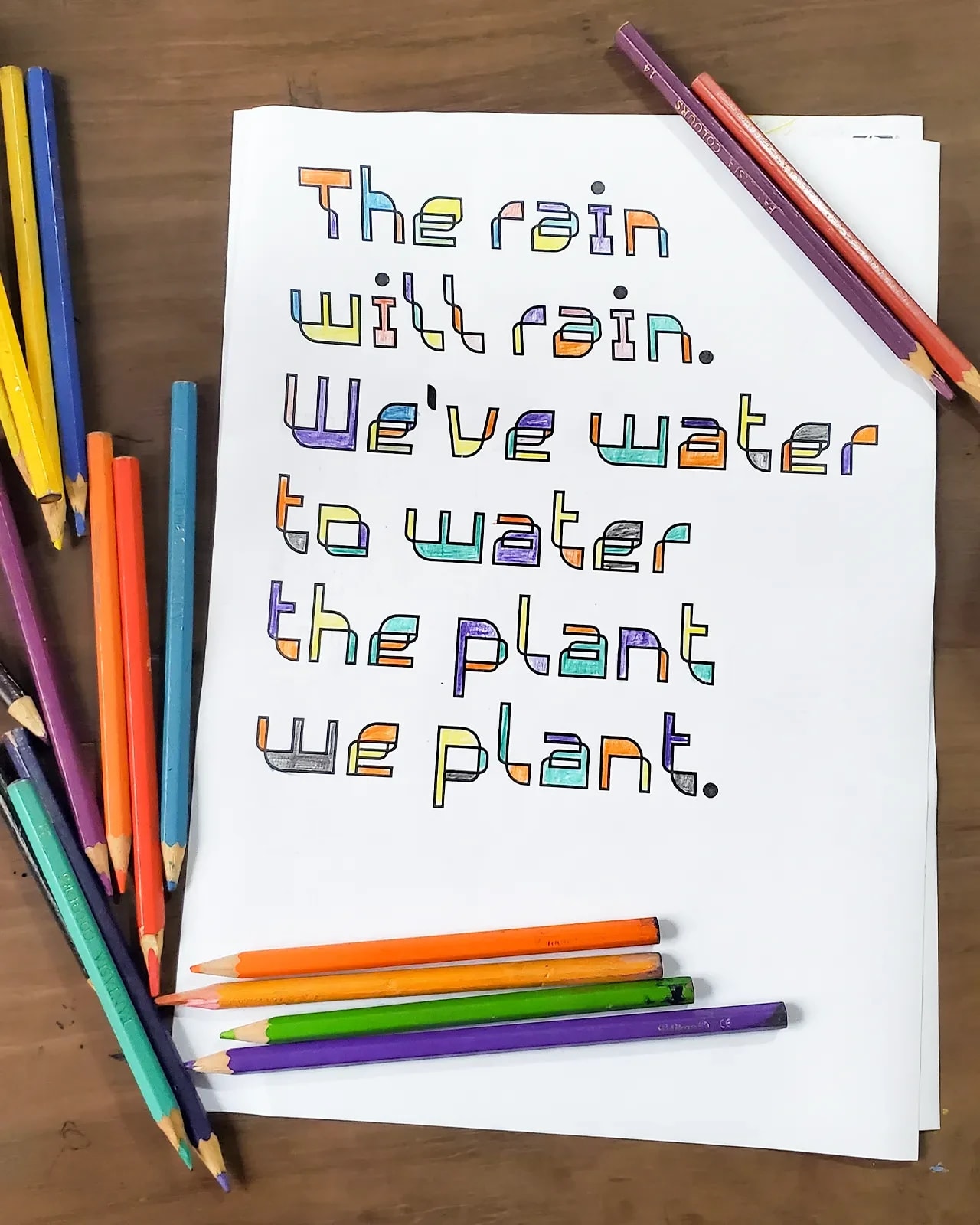
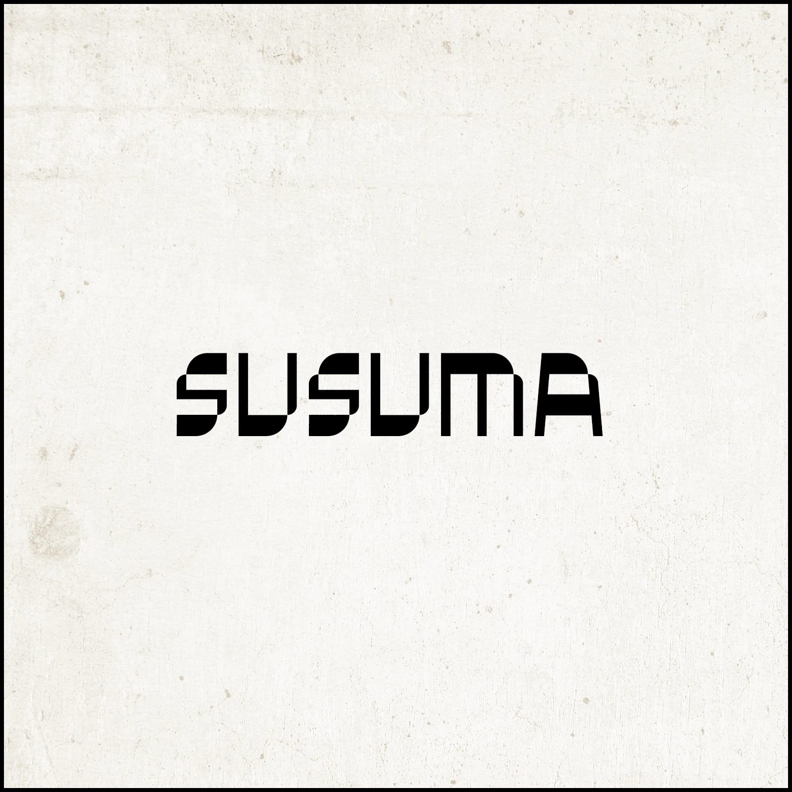
Susuma is a display typeface built around shifting forms, moving between solid and outline. Developed through type, writing and illustration, it explores how letters can move between language and image.
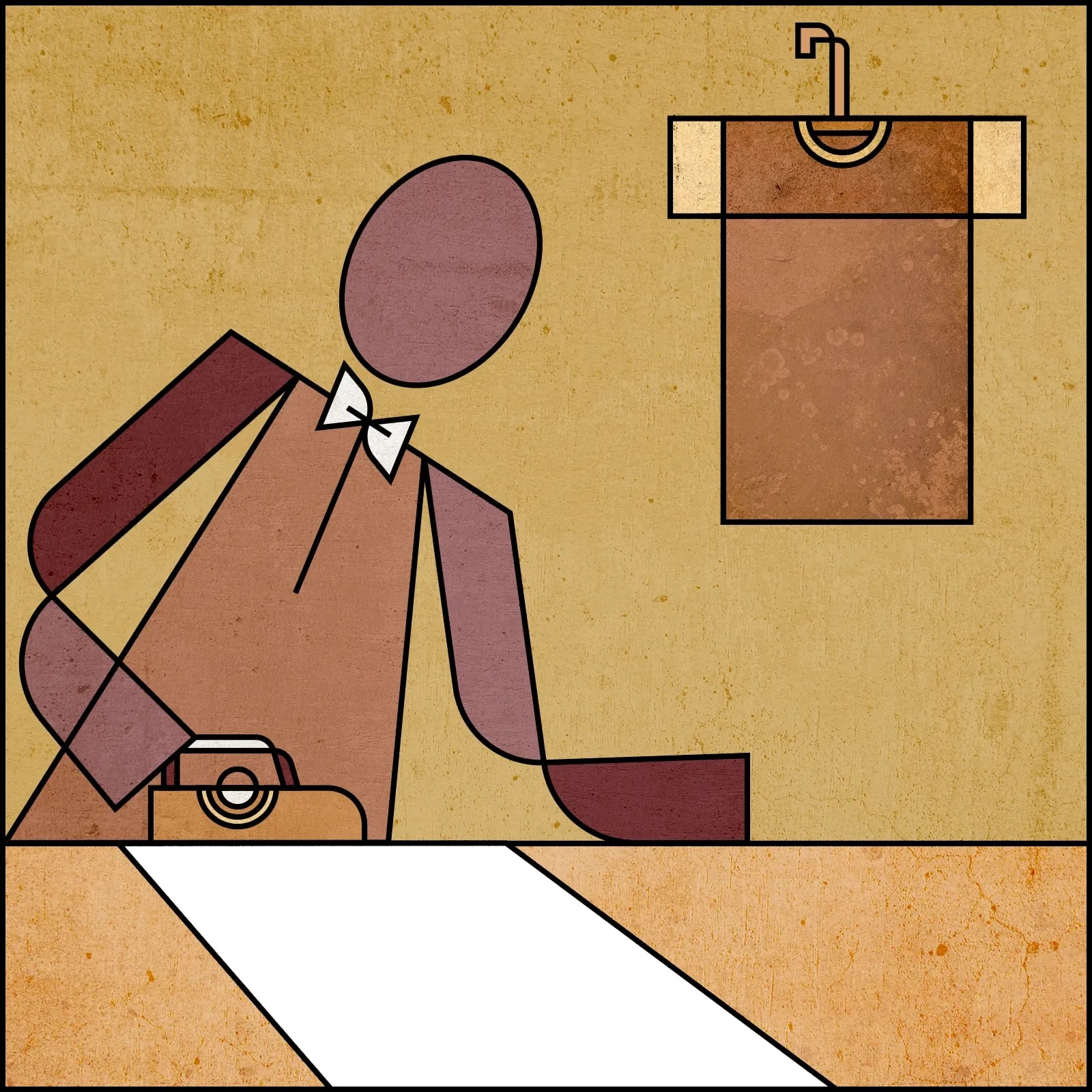
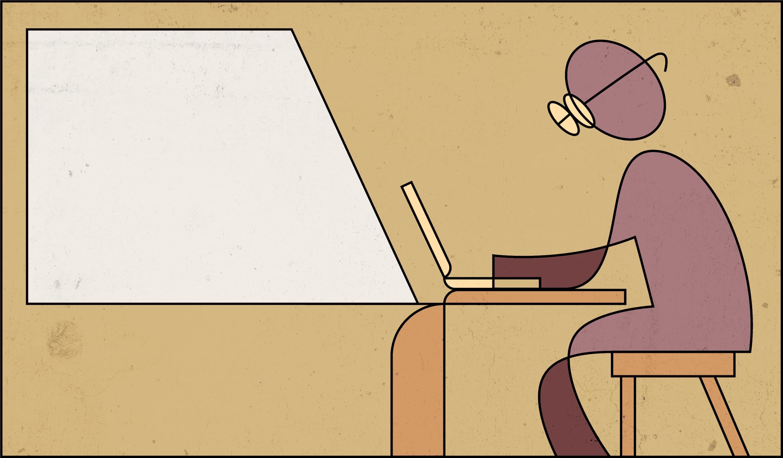
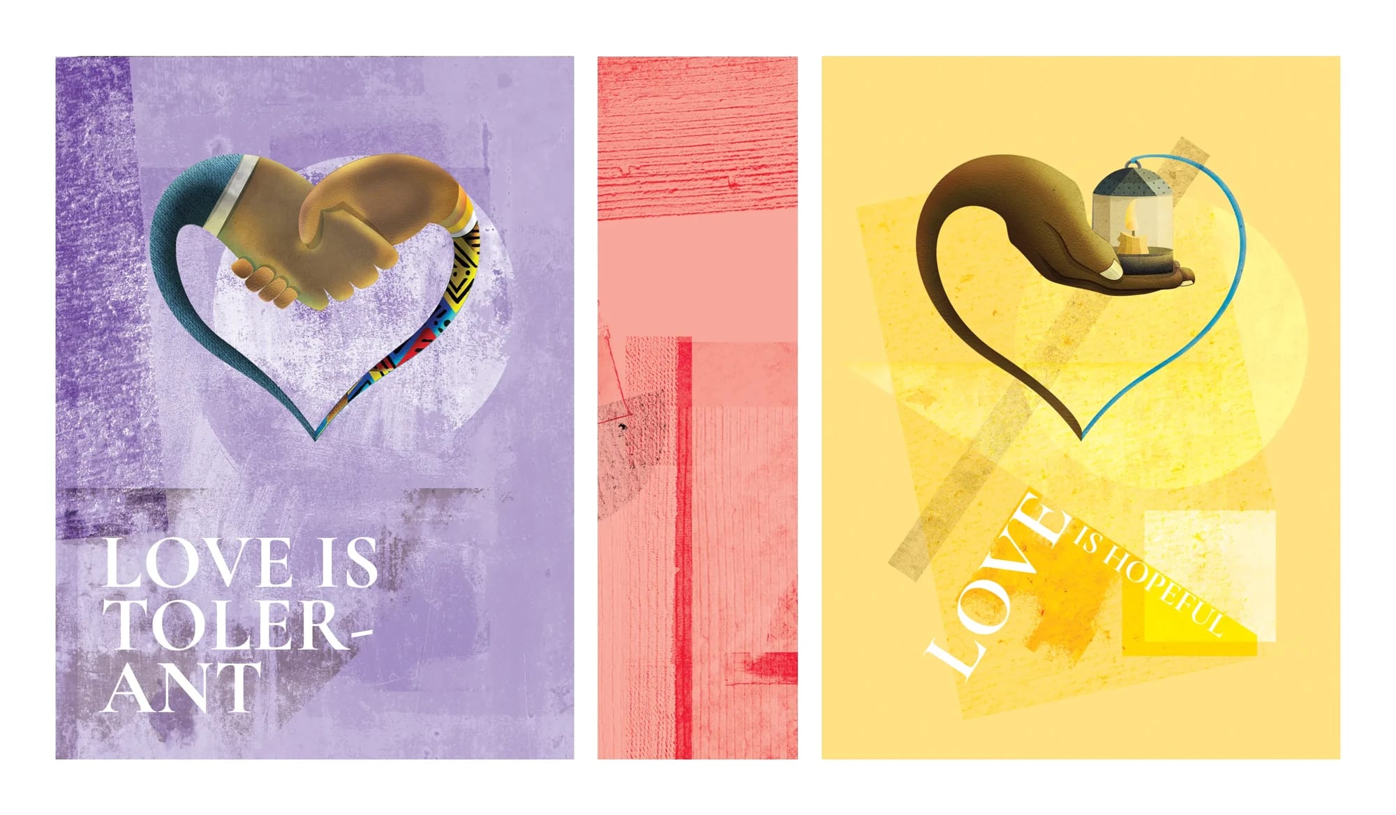
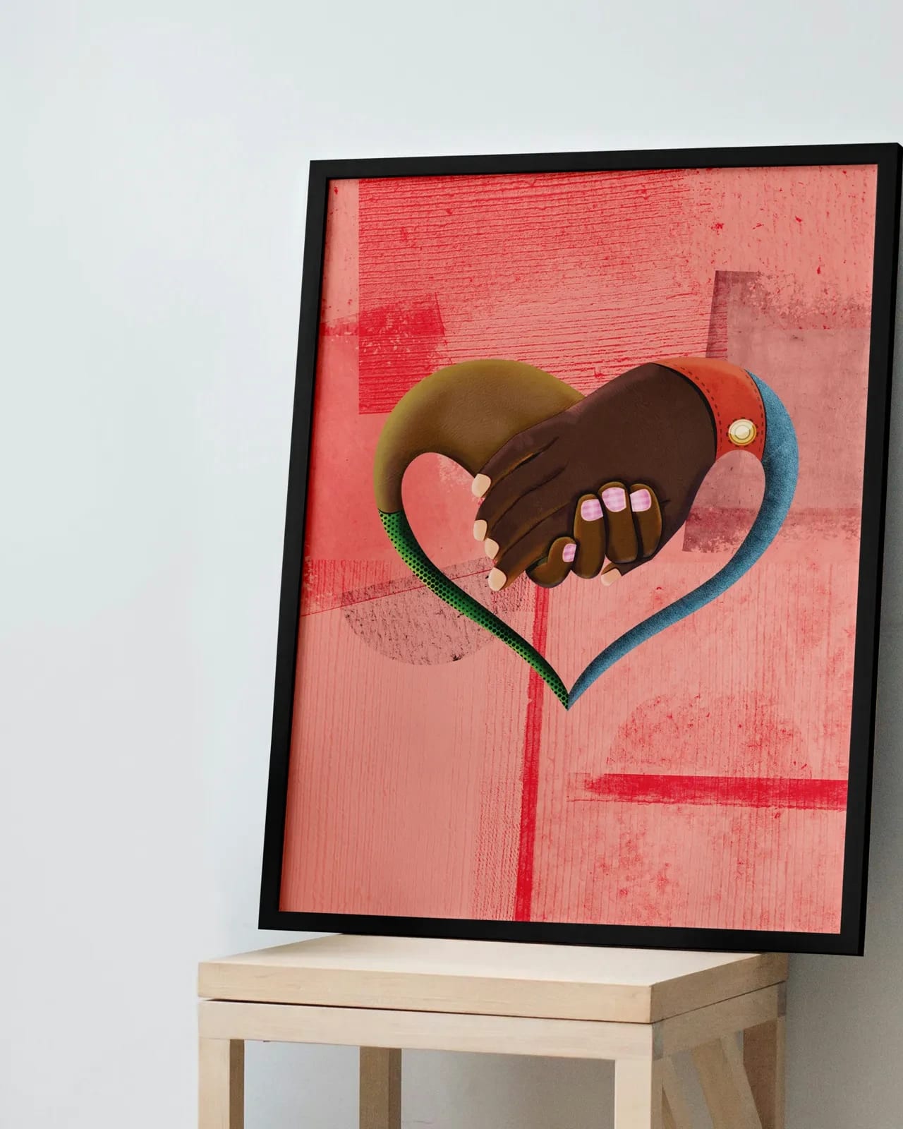
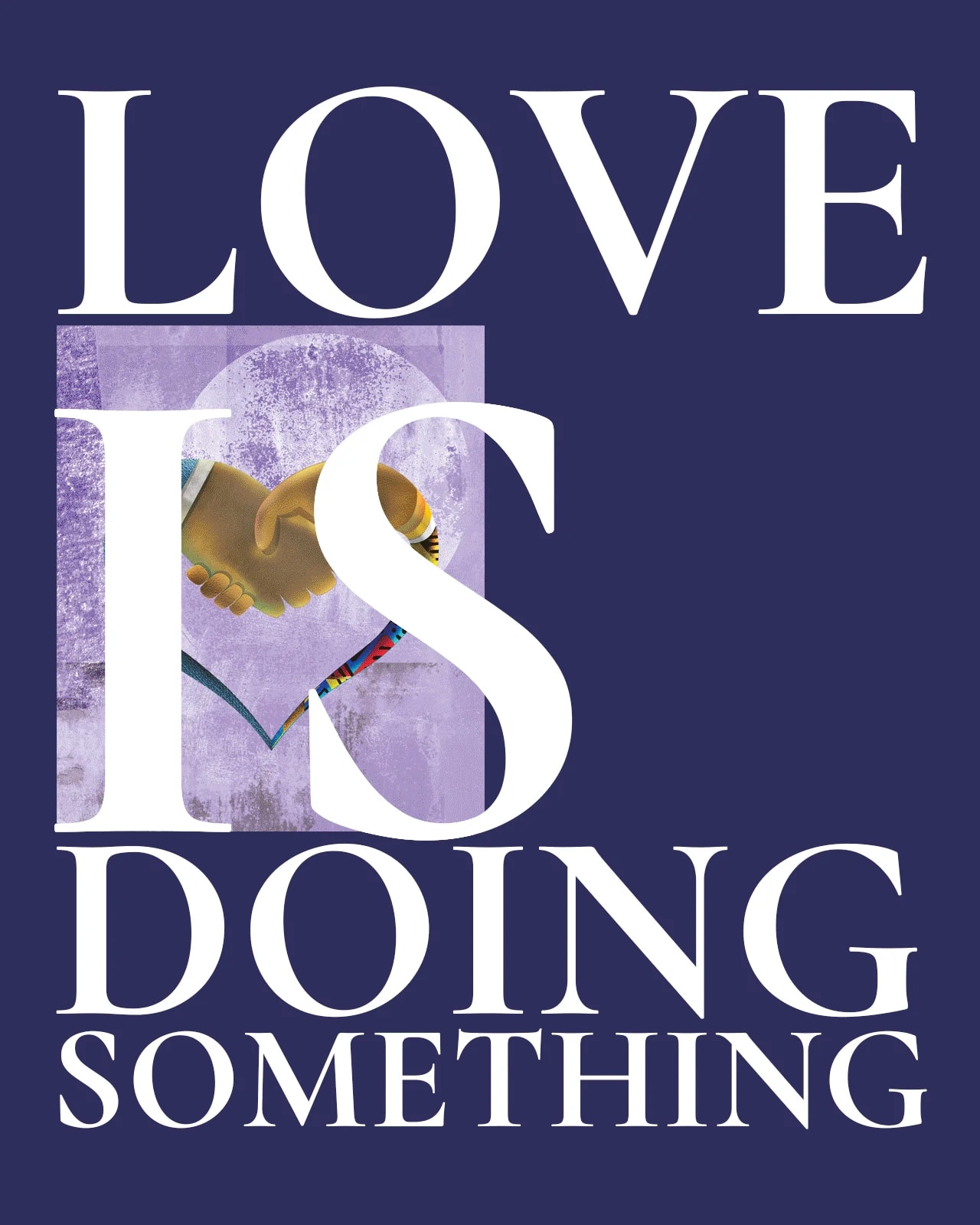
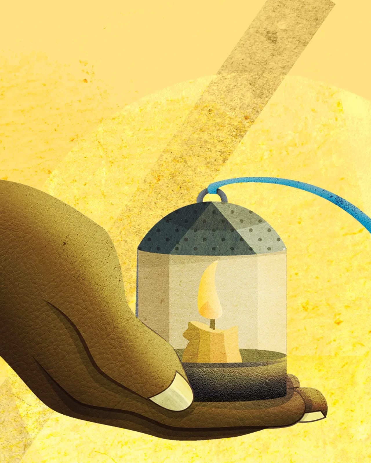
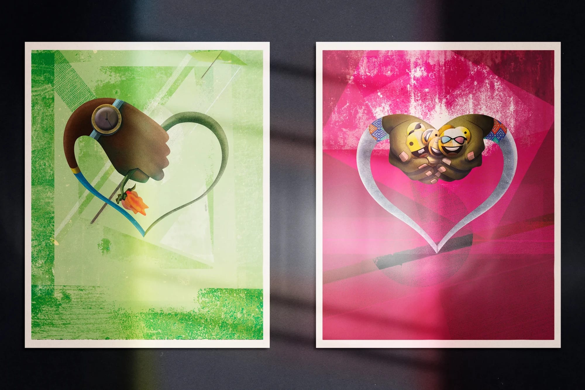
Love explores the many ways we experience and express love. Through illustration, typography and texture, each card turns a quality of love—patience, hope, tolerance, joy and care—into a visual story made to be shared.
(AME) — Eʋe for human. All human experience is worthy of thoughtful design. Art should honour people while preserving their legacy.
Mojaka is a visual practice built by Fiifi Dzànzi, working across identity, editorial, type, print, exhibition, and illustration for people and institutions in culture and the arts. Grab something from our store to support the practice.
Remotely in Ghana and elsewhere in the world
Mon–Fri 9AM–6PM
+233 557 860 607
hello@mojakastudio.com
@mojakastudio
